
Most small business owners choose a platform, pick a template, and wonder why nobody buys. What sells in ecommerce website design for small business is not the technology — it is trust signals that prove you are legitimate, product photography that replaces the in-store experience, a checkout that removes every barrier, and calls to action that guide the visitor at each step. Get the design layer right and a template store on Shopify converts better than a custom-built site that ignores these fundamentals.
This guide covers the specific design decisions that cost real money when you get them wrong — no platform comparisons, no template reviews, just the design layer that most guides skip entirely.
Why Design Matters More Than Your Platform
The platform debate is a distraction. Shopify, WooCommerce, Squarespace, BigCommerce — all of them can run a functional store. What separates a store that converts from one that does not is what happens after the platform is chosen.
Design in ecommerce is not about making things pretty. It is about structure — where you place elements on the page, what the visitor sees first, and how you guide them from landing to purchase. Every element either builds trust or creates doubt.
Visitors make a trust judgment about your store within seconds — before they read a single product description. For a small business with no brand recognition, that snap judgment is based entirely on visual design. Your layout, your product images, and your page structure are your credibility.
Large retailers get the benefit of the doubt. A shopper on Amazon does not pause to wonder whether the site is legitimate. Your store does not get that luxury — your design is your credibility.
Two stores selling the same candle on the same platform at the same price can have entirely different conversion rates. The one with professional product photos, visible reviews, and a clean checkout will outsell the one with blurry images and a cluttered layout every single time.
Platform features are table stakes. Design decisions are what separate a store that survives from one that scales.
The stakes keep growing. Mobile commerce is projected to represent 62% of all ecommerce sales by 2027 (Statista, 2025). If your store's design falls apart on a phone screen, you are losing the majority of your potential customers before they see a single product.

Trust Signals That Turn Browsers Into Buyers
A visitor who does not trust your store will not buy, regardless of product quality or pricing. For small businesses competing against established brands, trust signals are the highest-leverage design decision you can make.
The single most effective trust signal for a small store is visible, unfiltered customer reviews on every product page. Not testimonials on a separate page — star ratings and written reviews displayed next to the product, near the buy button. A product with 23 reviews and a 4.6 rating converts dramatically better than the same product with no reviews at all.
Here is what else works:
Security badges and payment logos. Display SSL lock icons and accepted payment method logos on your checkout page, above the fold — directly below the payment form, not in the footer where nobody scrolls. Shoppers look for these before entering card details.
A visible return policy. Link it in the header navigation and on every product page — not buried three clicks deep in a "Policies" section. A clear, fair return policy like "30-day returns, no questions asked" removes the fear of getting stuck with something that does not work.
Real contact information. A phone number, a business address, and a responsive email. This signals a legitimate operation. A contact form with no other information signals risk.
Social proof with specific numbers. "Rated 4.8 by 127 customers" builds more confidence than "Great quality!" from an unnamed buyer. Specificity is the trust signal — vague praise is noise.
If you are just starting and have zero reviews, ask your first ten customers directly. Send a follow-up email three days after delivery with a simple link to leave a review. Genuine reviews from real buyers are worth more than a thousand incentivised five-star ratings.
What does not work: fake urgency. Countdown timers and "only 2 left in stock" messages that are not true damage trust when customers catch on. Build trust with real signals — manufactured scarcity is a short-term trick with a long-term cost.
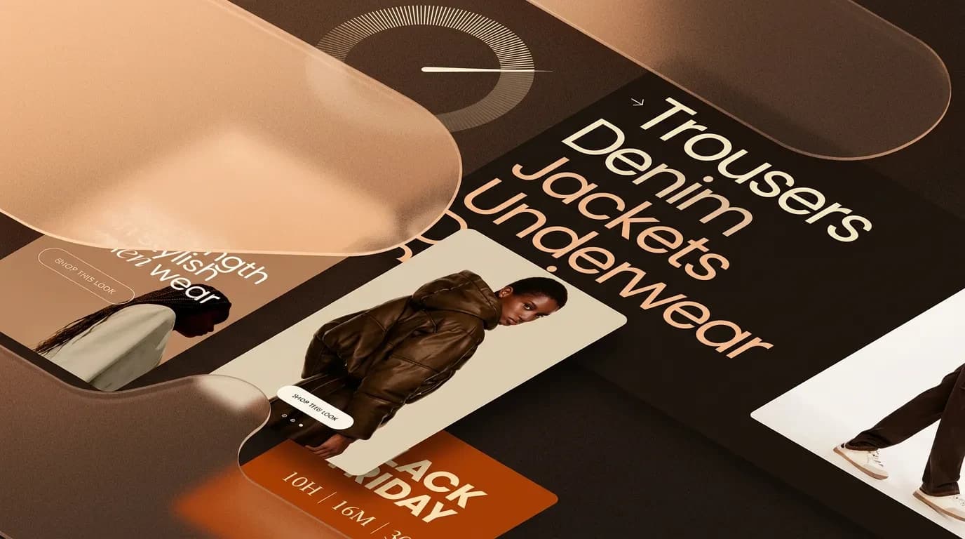
Product Photography and Layout That Sell
You do not need a professional photographer. You need a consistent setup — same background, same lighting, same angles across every product in your catalogue.
The minimum setup costs under $200: a white sweep background (a roll of paper or poster board), a ring light or window with diffused natural light, and a phone with a decent camera. What matters is not the equipment — it is consistency. Consistent product photography signals a professional operation. Inconsistent photos signal a side project.
Every product should have at least four images: front view, side view, close-up detail, and a scale shot with a common object so the customer understands actual size. If you sell different sizes or colours, photograph each variant individually. Shoppers should never have to guess what the "midnight blue" option actually looks like.
For products that need context — furniture, clothing, tools — add a lifestyle shot showing the product in use. Colour accuracy matters — calibrate your screen or shoot comparison swatches if the product's colour is a selling point.
Zoom functionality directly increases conversion rates. Online shoppers cannot pick up your product and inspect it. Zoomable image galleries let them examine texture, stitching, or material quality — the closest substitute for handling the product themselves.
Your product page layout should follow a predictable structure. On desktop: image gallery on the left, product details on the right. Above the fold: primary image, product title, price, and the add-to-cart button.
Below the fold: full description, specifications in an accordion, and customer reviews. Lead your product description with what the product does for the customer, not what it is made of. "Keeps your coffee hot for 12 hours" sells better than "Double-walled stainless steel vacuum insulation."
Features matter, but benefits close the sale. List the specifications — dimensions, materials, weight, care instructions — in a scannable format using bullet points or a table.
For complex or unfamiliar products, a 15-second video showing the product in action outperforms five additional still images. Video gives shoppers the confidence that static images cannot — especially for products with moving parts, unusual shapes, or features that are hard to photograph.
Mobile-First Product Pages That Actually Convert
Designing for desktop first and hoping it works on mobile is how small stores lose the majority of their potential sales. Mobile commerce already accounts for more than half of online shopping, and that share grows every year.
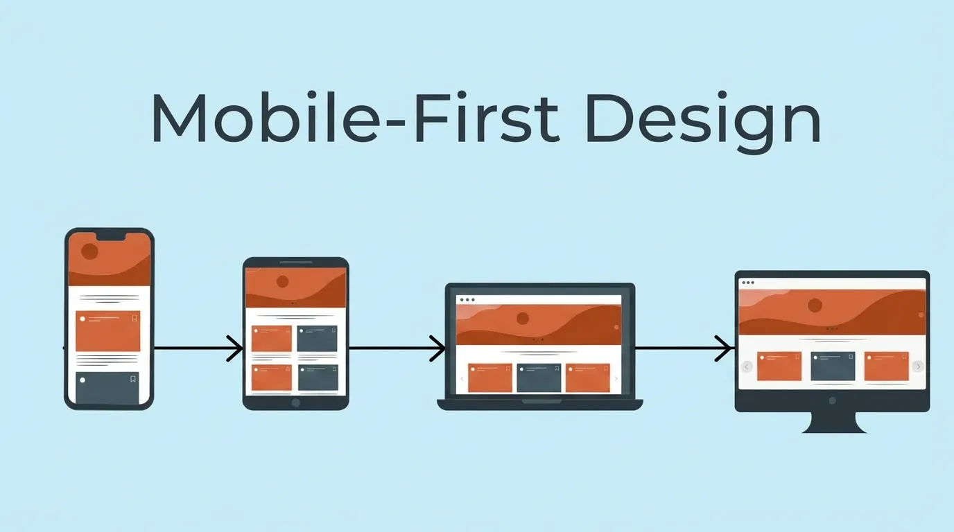
If you have to choose between perfecting your desktop or mobile experience, choose mobile. That is where your customers are.
Mobile product page design has different rules than desktop:
Full-width images. No side-by-side layouts. The product image should fill the screen width so customers can see detail without pinching and zooming.
A sticky add-to-cart button. When the customer scrolls past the product image to read the description, the buy button should follow them down the page. If they have to scroll back up to add the product to cart, some will abandon the effort.
Accordion sections for product details. On a phone screen, a 300-word product description creates an endless scroll. Collapse details into expandable sections — Description, Specifications, Shipping, Reviews — so the customer can jump directly to what they care about.
Touch-friendly controls. Size selectors, colour swatches, and quantity pickers need to be large enough to tap accurately with a thumb. Tiny dropdown menus designed for a mouse cursor frustrate mobile shoppers and cost sales. Leave at least 8 pixels of padding between tappable elements.
Speed is non-negotiable. Compress every image. Use WebP format instead of JPEG or PNG. Lazy-load images below the fold so they only download when the customer scrolls to them. Your product page should load in under 2.5 seconds — that is Google’s Largest Contentful Paint threshold, and it directly affects both your search ranking and your bounce rate (Google, 2024).
Test on a real phone, not a desktop browser resized to look small. The experience is different and the problems are different.
Pay attention to your navigation menu. Complex dropdown menus with nested categories do not work on touchscreens. Use a hamburger menu with clear top-level categories and let customers drill down from there. If your store has fewer than 20 products, skip subcategories entirely — a flat list is faster and cleaner.
The Checkout Flow Most Small Stores Get Wrong
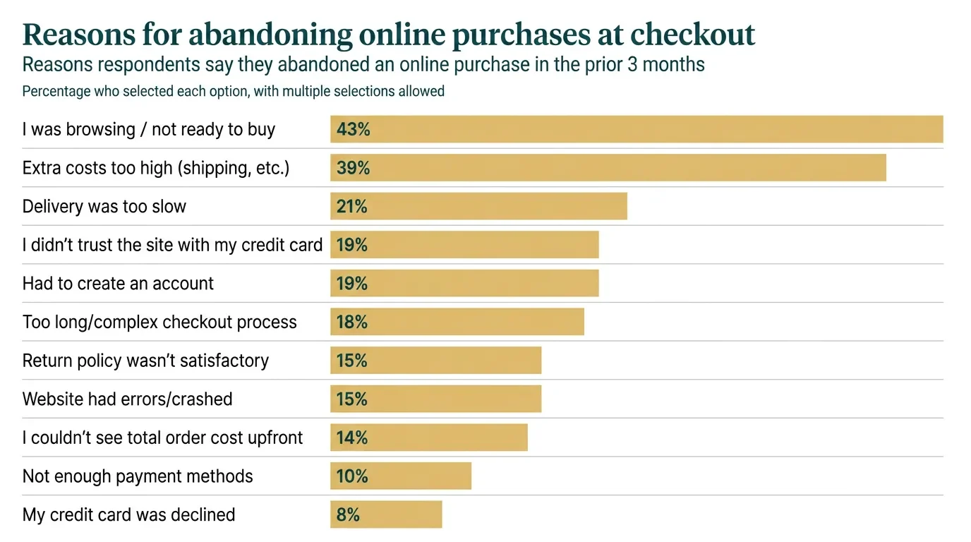
The average online cart abandonment rate is 70.19% (Baymard Institute, 2024). Seven out of ten people who add a product to their cart leave without buying. For a small store with limited traffic, every abandoned cart is revenue you cannot afford to lose.
The most common checkout design mistakes:
Forcing account creation. If a customer has to create an account before they can pay, a significant percentage will leave. Guest checkout is not optional — it is the single fastest way to reduce cart abandonment. Offer account creation after the purchase is complete, not before.
Surprise costs. Shipping fees, taxes, or handling charges that appear for the first time on the final checkout screen drive abandonment. Show the total cost — including shipping — from the cart page, before the customer enters their payment information.
Too many form fields. Name, shipping address, email, payment — that is all you need. Do not ask for a phone number unless you send delivery updates via SMS. Every extra field is a point where customers drop off.
No progress indicator. A simple three-step bar — Cart, Shipping, Payment — tells the customer how close they are to done. Without it, checkout feels like it could continue indefinitely, and uncertainty makes people quit.
Missing payment options. 13% of customers abandon checkout if they do not see their preferred payment method. At minimum, accept credit cards, Apple Pay, and Google Pay. If your average order value is above $100, add a buy-now-pay-later option like Klarna or Afterpay.
One more thing most small stores miss: abandoned cart recovery emails. Set up a three-email sequence — the first at one hour after abandonment as a gentle reminder, the second at 24 hours highlighting the product benefits, and the third at 72 hours with a small incentive if your margins allow it. This sequence alone can recover 5–15% of abandoned carts. Most ecommerce platforms include this feature — turn it on.
CTA Hierarchy — What to Ask For and When
Not every page on your store has the same goal. Treating every page like a sales pitch creates confusion and drives visitors away.
One primary call to action per page. That CTA should be the most visually prominent element on the screen — high contrast with the background, clear action text, large enough to tap on mobile.
Here is how the hierarchy works:
Homepage: "Shop Now" or "Browse Collections." Broad, low pressure. The homepage CTA moves the visitor into the catalogue — it does not push for a purchase.
Category page: "View Product" or a clickable product card. Functional, clear, minimal friction. The category page is for browsing, not buying.
Product page: "Add to Cart." High-contrast button, above the fold, visible without scrolling. This is the most important CTA on your entire site.
Cart page: "Proceed to Checkout." Prominent, with no competing navigation pulling the customer away from completing their order.
The most common CTA mistake is stacking multiple competing actions on the same page. A product page with “Add to Cart,” “Add to Wishlist,” “Share on Facebook,” “Sign Up for Updates,” and “Chat with Us” gives the customer too many choices. Decision fatigue kills conversion. Strip your product page down to one primary action: add to cart.
Button design matters more than most store owners think. A green button on a green background disappears. A bright, contrasting button with clear text — "Add to Cart" not "Submit" or "Continue" — removes ambiguity and drives clicks. Use your brand's accent colour for CTA buttons and reserve that colour exclusively for primary actions so it always stands out.
What Ecommerce Website Design for Small Business Costs
Good design does not require an expensive agency engagement. The investment depends on where you start and what you prioritise.
Template-based store on Shopify, Squarespace, or WooCommerce: $30–60 per month for the platform, plus a premium theme ($100–300 one-time) if the free options do not fit your brand. This gets you a professional-looking store with minimal design work.
Custom template modifications — adjusting fonts, colours, layout, and checkout flow beyond what the theme builder allows: $500–2,000 depending on complexity. This is where most small stores get the best return on their design investment.
Custom design from scratch — a designer and developer building your store from a blank canvas: $3,000–15,000 or more. This makes sense when your brand demands a unique experience that no template can deliver.
Product photography setup — a basic home studio with sweep background, lighting, and a tripod: $200–500. This is the single highest-ROI design investment a small store can make.
When budget is tight, prioritise in this order: product photography first, trust signals second, checkout optimisation third, custom visual design last. Each step builds on the one before it, and the first two cost almost nothing beyond time.
The question is not whether you can afford good design — it is whether you can afford to keep losing sales to a store that does not look trustworthy. A 1% improvement in conversion rate on 5,000 monthly visitors at a $50 average order value generates $2,500 more revenue per month. Even a $2,000 design investment pays for itself in the first month.
Where to Start If You Are Redesigning Your Store
Start by buying something on your own store. Use your phone. Go through the entire experience — finding a product, reading the description, adding it to cart, entering payment details.
Every moment of friction, hesitation, or confusion you feel is something your customers feel too. Write it all down.
Then prioritise by impact:
- Add trust signals today. Enable customer reviews on every product page. Display payment badges on your checkout page. Move your return policy link to the header.
- Fix your product photography this week. Set up a consistent shooting environment and reshoot your top-selling products first.
- Test your mobile checkout this month. Complete a real test purchase on your phone. If any step frustrates you, redesign it.
- Review your CTA hierarchy. One primary action per page. Remove or visually suppress competing buttons.
These four steps cost almost nothing and address the design problems that lose the most sales.
If you want someone to look at your store's design with experienced eyes — book a free discovery call with Vediwood. We will tell you what is costing you sales and what to fix first. No pitch — just an honest answer.
Follow Us
Most founders read us once and change something that week.
Every issue covers one thing that makes your website work harder — better conversion, stronger SEO, or smarter design. No fluff, no agency speak. Just the decision you need to make this week.
Our Team

Sadiki Said
Full Stack Developer

Nezha Essyed
Content Strategist