Design System for Startups: When and How to Build One
Most startups either skip a design system entirely or overbuild one before they need it — both cost time they cannot get back. A plain guide to what a startup design system actually looks like, when to start, and how to avoid the mistakes that set teams back.

Most startup teams skip a design system entirely and pay for it at series A. Some build one too early and spend weeks on infrastructure while competitors are shipping. The right move is neither.
A design system for startups is not Material Design. It is not a six-month project. And it is not optional forever. The decision comes down to one question: at what point does not having one cost more than building it? This guide gives you a plain answer — and a clear picture of what a startup-sized design system actually looks like before you commit.
What a Design System Actually Is (Not the Enterprise Version)
The mental image that kills this conversation is Material Design. When founders hear "design system," they picture Google's or IBM Carbon — thousands of components, complete accessibility documentation, dedicated platform teams maintaining everything. The comparison is paralyzing, and usually irrelevant.
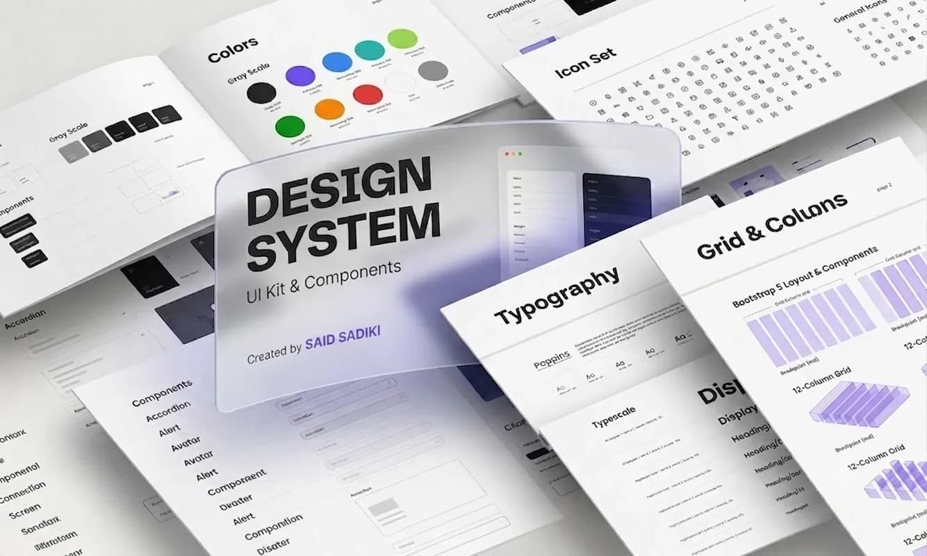
A design system is three things: a set of shared design decisions (your colours, typography, and spacing), a library of reusable UI components (button, input, card, modal, navigation), and documentation that explains when and how to use them.
For a startup, the whole thing might live in a single Figma file with a two-page Notion doc attached. That counts. The purpose is not comprehensiveness — it is consistency. One source of truth that every designer and developer can reference so the product does not look like it was built by five different people across twelve different sprints. Without a system, that is exactly what happens — not all at once, but gradually, until you look at your own product and wonder when it became incoherent.
Does Your Startup Actually Need a Design System Right Now?
Not immediately. In the first weeks of a product, visual consistency matters far less than understanding whether the product itself is right. Building a design system before you have validated what you are building is optimising the wrong thing — you might redesign the entire product next month.
The question most founders ask too late is a better one: at what point does not having one start slowing us down?
Three signals tell you it is time:
Your designer or developer is rebuilding the same element over and over. Every new feature requires a new button variant, a new card layout, a new modal — because there is no reusable reference. That is waste you can see if you track sprint time.
Different parts of the product look subtly inconsistent. The primary blue is #2563EB in one screen and #2465EB in another. Spacing between text and input fields is 12px here and 16px there. Users notice this even when they cannot name it. It registers as "feels cheap."
A new team member joins and spends their first week asking which version is current. When onboarding requires a tour of historical Figma files, the system has already become a problem — it is just not a documented one yet.
If none of these apply, wait. If one does, start.
The Real Cost of Skipping a Design System Early
Here is what happens without one as a startup scales.
Every new feature takes longer to design because the designer rebuilds from scratch or hunts through previous files for the "right" component. Every design handoff generates unnecessary back-and-forth: which button is this, what are the hover states, what is the border radius, is this the same blue as the login screen? Every design change requires a manual find-and-replace across every screen in the product.
The compounding effect is what founders miss. It does not show up as a single catastrophic delay. It shows up as a persistent 10–15% tax on every sprint — features take slightly longer, rework happens slightly more often, new designers take slightly longer to get up to speed. That tax is invisible until you have a design system — and then suddenly, it is not.
A January 2026 research report from Figma's Design Executive Council found that teams with an active design system ship new features 44% faster than those building without one. At five engineers the overhead is manageable. At fifteen, it becomes structural drag on every sprint.
There is also a user-facing cost. Inconsistency in UI — subtly different button sizes, slightly off-brand shades of the same colour, inconsistent spacing across screens — registers as low quality. Users cannot always name it. They feel it, and it affects whether they trust the product enough to pay for it.
When to Start: The Right Stage
A design system earns its cost when the product is shipped and used by real people (not just prototyped), when more than one person is making design or development decisions, and when you are building the same types of screens repeatedly — dashboards, forms, listings, modals.
If you are pre-launch with a single designer and a product that changes shape every week: use an existing open-source component library instead. Radix UI provides accessible, unstyled primitives you can theme to your brand. Shadcn/UI gives you styled components built on Radix, ready to ship in hours. Both can be adopted in a day and replaced when you outgrow them. Moving fast is the priority — do not build infrastructure for a product you might pivot.
If you are post-launch with a product that is stabilising — users are staying, core flows are not changing every sprint, and you are starting to hire — start now. The longer you wait past this point, the more debt accumulates.
A useful rule from building products at Vediwood: the right moment to start is when you catch yourself pasting the same component into a design file for the second time. That copy is the signal that a reusable source of truth would save time. Start with that one component, and build the system outward from there. If you want to see where a design system fits in a full product build, see how we structure a project from the start.
What a Startup Design System Actually Looks Like
Most guides describe the system you should aspire to. This section describes the one you should build today.
Layer 1 — Design tokens. Define your colours: primary (one brand colour), secondary (optional), error, warning, success, and a neutral grey scale from light to dark. Define typography: your font family, a type scale with 5–7 sizes, and the weights you actually use (regular, medium, semibold). Define spacing: pick an 8px base grid and derive your scale (4, 8, 12, 16, 24, 32, 48, 64px). In Figma, these become local variables. In code, they become CSS custom properties or a Tailwind config file. This layer takes half a day and never needs to be rebuilt.
Layer 2 — Core components. Build the 10–12 UI elements you use on every screen. For most products that means: button (default, secondary, ghost, and destructive variants — each with default, hover, disabled, and loading states), text input (with label, placeholder, error, and success states), select, checkbox, modal, card, badge, and a navigation component. Build these once. Connect every style property to your tokens. Document the variants with a note on when each one is appropriate.
Layer 3 — Documentation. Do not overbuild this. A Figma file with annotated component examples and a short Notion page covering naming conventions, the spacing system, and basic usage rules is enough for a team of under ten. The test: could someone who joined today use the system without asking a colleague? If yes, the documentation is working.
The total build time for this three-layer system is one to two weeks for a solo designer with engineering support. Every week after that, the payoff compounds.
The Three Mistakes That Set Startups Back
Building too much too soon. A founder sees Shopify Polaris and decides to build something with the same scope. Three months later, the system is 60% complete, engineering has been waiting, and the product has drifted from what the system was built to support. Start with the minimum viable system — tokens, ten components, basic docs — and add only when a real need appears in front of you.
Treating it as a design project, not an engineering one. A design system that exists in Figma but not in code is a mood board. The components need to be built in code, tested, and published to a shared package or repository before they are real and usable. Involve the lead engineer in the architecture decision from the start: do you build on an existing headless library (Radix, Shadcn) or build custom components? The answer depends on how far your product diverges from standard patterns, and it affects the system's flexibility for years.
No ownership. Someone has to be responsible for the system — deciding when a new component gets added, when a token changes, when documentation becomes outdated. Without named ownership, the system drifts and becomes a liability instead of an asset. In a small team, this is usually the lead designer or the first full-stack engineer. It does not need to be a full-time role. It needs to be a named responsibility with protected time.
Figma AI and What Changes for Startups in 2026
The barrier to starting a design system has dropped significantly in the past twelve months. Figma's AI features — rolled out across 2025 — can generate component variants from a single reference, apply variables across frames in seconds, and suggest naming conventions based on patterns that already exist in your file.
What used to take a designer a full week to scaffold can now take a day. The "we do not have time" argument is weaker in 2026 than it was two years ago. The upfront infrastructure cost has dropped. The payoff — faster sprints, fewer handoff errors, easier onboarding — has not changed.
If your team is on Figma and has not yet explored its variables system and component properties panel, that is the starting point. Set up your tokens, wire them to your first button, and the system will build faster than you expect.
Ready to Build a Product with Visual Consistency from Day One?
A design system is not an enterprise concept. It is a shared decision-making layer that protects your velocity as the product and team grow. Start with tokens, build your core components, document as you go — and stop adding complexity before you need it.
The pattern we see consistently at Vediwood: teams that build this layer early — even a lightweight version — ship faster and accumulate far less rework than teams that try to retrofit it later. The retrofit is always more expensive than the original build. If you are building a web product and want design and development to move together from day one, see how we approach product builds — system thinking included, no design debt inherited from a rushed MVP.
Follow Us
Most founders read us once and change something that week.
Every issue covers one thing that makes your website work harder — better conversion, stronger SEO, or smarter design. No fluff, no agency speak. Just the decision you need to make this week.
Our Team

Sadiki Said
Full Stack Developer

Nezha Essyed
Content Strategist