Decision Fatigue in Website Design: Why Less Sells More
Too many choices on your website are driving visitors away — not because the options are bad, but because choosing is exhausting. The psychology behind decision fatigue and a section-by-section plan to fix your navigation, pricing, and CTAs.

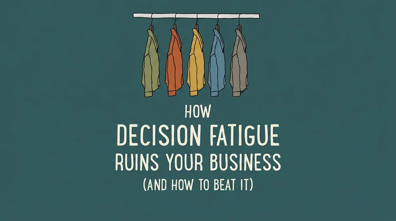
You added more products, more pricing tiers, more navigation links — and your conversion rate dropped. That is not a coincidence.
Decision fatigue in website design is one of the most common reasons business owners lose sales on sites that get plenty of traffic. Your visitors are not lazy or uninterested. They are overwhelmed.
Every extra option you give them makes the decision harder. And when choosing gets hard enough, they stop choosing altogether — they close the tab and leave. The psychology behind this is well-documented. The fix is more straightforward than most design agencies will tell you.
Too Many Choices Are Costing You Sales — The Data Is Clear
In 2000, psychologists Sheena Iyengar and Mark Lepper ran what became one of the most cited experiments in consumer behaviour. They set up two jam-tasting displays at a grocery store. One table offered 24 varieties. The other offered 6.
The large display attracted more browsers. But the small display sold ten times more jam. 24 options produced a 3% purchase rate. 6 options produced a 30% purchase rate. Same product, same store, same day — only the number of choices changed.
That ratio is not unique to jam. It shows up everywhere businesses present choices online.
Landing pages with multiple competing offers consistently convert worse than pages with a single clear action. E-commerce product pages with excessive visible options see higher bounce rates and lower add-to-cart rates. Pricing pages with more than three tiers lose to simpler alternatives in A/B tests, again and again.
The pattern extends beyond individual pages. SaaS companies that reduce pricing from five tiers to three see measurable sign-up improvement. Online retailers that cut homepage product grids from 20 items to 8 measure double-digit lifts in click-through to product detail pages.
Think about it from your visitor's perspective. Before they even reach your site, they have already made hundreds of decisions that day — what to wear, what to eat, how to prioritise their work. They arrive at your homepage with a limited reserve of mental energy. If your site immediately presents 12 navigation items, 3 hero banners, and 4 calls to action, you have burned through whatever patience they had left before they read a single word.
The mechanism is the same in every case. More choices feel like more freedom. But more choices actually create more anxiety, more hesitation, and more abandoned sessions. Your visitors are not deciding slowly — they are deciding not to decide at all.
What Decision Fatigue Actually Does to Your Visitors
Decision fatigue is a psychological phenomenon where the quality of a person's decisions degrades after making too many in a row. It does not matter how small the decisions are. Every choice — from scanning a navigation menu to picking a product colour — draws from the same finite reserve of mental energy.
Two well-established principles explain why this hits websites particularly hard.
Hick's Law, named after British psychologist William Edmund Hick, states that the time to make a decision increases logarithmically with the number of options. A visitor choosing between 3 navigation items decides in under a second. A visitor facing 12 items takes measurably longer — and is significantly more likely to leave without clicking anything at all. This is not a guideline. It is a measurable, predictable relationship between the number of options and a person's response time, confirmed across dozens of studies since 1952.
The paradox of choice, described by psychologist Barry Schwartz, explains what happens after the decision is made. When people choose from a large set, they feel less satisfied with what they chose. They keep imagining the options they rejected. On a website, this creates a destructive loop: the visitor picks a product, second-guesses it, goes back to compare, gets more fatigued, and eventually abandons the purchase entirely.
But the biggest damage is not in these major decisions. It is in the micro-decisions your site forces without you realising.
Every page on your website produces dozens of small, unconscious choices. Should I read this paragraph or skip it? Is this the right button? Should I scroll further or go back? Do I fill out this form now or come back later? Which of these four calls to action is the one I actually need?
Each micro-decision chips away at your visitor's ability to complete the action that actually matters. By the time they reach your checkout or contact form, they may not have enough mental energy left to follow through. The irony is brutal: the more helpful content you add, the more decisions you create, and the harder you make it for someone to convert.
Your visitors do not arrive at your site with a full tank. By the time they find your page, they have already made dozens of decisions that day — at work, at home, on other websites. Your website is competing for whatever mental energy remains. A site that demands 20 decisions before the visitor can take action will lose to one that demands 3.
6 Signs Your Website Has a Decision Fatigue Problem
You do not need a full UX audit to spot this. Check your site against these six signals. If two or more apply, decision fatigue is likely hurting your conversion rate.
Your navigation has more than 7 top-level items. Research from the Nielsen Norman Group consistently shows that 5–7 top-level navigation links is the effective maximum for fast scanning. Beyond that, visitors stop choosing and start guessing. Mega menus with 30 or more links are worse — they turn navigation into a reading comprehension task.
Your pricing page shows more than 3 tiers. Three tiers work because they create a natural anchor. The low option establishes the floor. The high option makes the middle look reasonable. Add a fourth or fifth tier and visitors shift from comparing value to comparing their own confusion with the effort of leaving the page.
Your homepage has more than one primary call to action. "Book a demo," "Start a free trial," "Download the guide," and "Watch the video" — all visible on the same screen, all styled as primary buttons. When everything looks equally urgent, nothing feels urgent. One page, one primary CTA. That is the rule.
Your product pages show all options at once. Colour, size, material, finish, engraving, gift wrapping, express shipping — displayed as 30 or more clickable elements on a single screen. Every visible option is a decision your visitor has to process, even if they never click it. The cognitive load of seeing all choices at once is the problem, not the choices themselves.
Your forms ask for more information than you need. Every form field is a decision point. Name, email, phone number, company name, job title, industry, budget range, timeline, message — that is nine moments where a visitor can decide the form is not worth finishing. Most of them will decide exactly that.
Your pages compete with themselves. Sidebars with related articles, pop-ups offering newsletter sign-ups, sticky banners with promotional offers, chatbot widgets pulsing in the corner. Each element is another demand on the visitor's attention — another micro-decision that pulls focus from the primary goal of the page.
How to Fix Decision Fatigue in Your Website Design
The goal is not to strip your site down to nothing. It is to reduce the number of decisions a visitor has to make at each step. Think of it as clearing the path, not shrinking the building.
Simplify Your Navigation
Cut your top-level navigation to 5–7 items. Group related pages under clear dropdown categories with descriptive, plain labels. "Services" works better than "What We Do For You." Check your analytics: any link clicked by fewer than 5% of visitors should be moved to the footer or removed entirely. Your navigation should reflect how visitors think, not how your company is organised internally.
Restructure Your Pricing Page
Offer three tiers. Highlight one as "Most Popular" or "Recommended" — this visual anchor guides visitors toward the middle option and eliminates most of the comparison work. List only the features that differ between tiers in the main comparison table. Shared features belong in a footnote or expandable section, not repeated three times across the columns.
Focus Each Page on One Primary CTA
Decide the single most important action for every page on your site. Make that action the only primary CTA — large, coloured, impossible to miss. Secondary actions can exist but must be visually recessive: smaller text, no background colour, positioned below the fold. Your visitor should never have to choose which button to click.
Use Progressive Disclosure on Product Pages
Stop showing every option at once. Let visitors choose one attribute at a time. A clothing retailer that moves from a 40-variant grid to a stepped flow — "Pick your colour" then "Pick your size" — reduces the visible decision from 40 options to 5 or 6 at each step. The total options stay the same. The mental effort drops dramatically.
Reduce Your Form Fields
Ask only for what you need to start the conversation. For most contact and enquiry forms, name and email is enough. If you genuinely need more information, break the form into steps — collect the basics first, then ask for details on the next screen. Every field you remove increases the chance the visitor completes the submission.
Set Smart Defaults
Pre-select the most common option in dropdown menus and radio buttons. Auto-detect location for shipping or currency. Remember returning visitor preferences using cookies. Every default you set is one decision your visitor does not have to make — and one fewer moment where they might abandon the page.
Remove Competing Elements
Audit every page for elements that compete with the primary action. Pop-ups, chatbot widgets, sidebar promotions, sticky banners, social share buttons — each one is a micro-decision that pulls attention from what actually matters. If an element does not directly support the page's primary goal, remove it or delay it until the visitor has completed the main action.
Why Removing Options Actually Increases Conversions
Business owners resist this advice because it feels counterintuitive. Fewer options should mean fewer customers served — right?
The opposite is true. And decades of behavioural research explain why.
When people face fewer options, they spend less energy deciding and more energy acting. They feel more confident in their choice because they are not second-guessing the alternatives they rejected. And they are more satisfied afterward, because fewer alternatives mean less post-purchase regret.
This behaviour is called satisficing — choosing the first option that meets your criteria instead of evaluating every possibility. Most website visitors are satisficers, not maximisers. They do not want to compare 12 options side by side. They want to find something that works, choose it fast, and move on with their day.
Steve Krug, in his influential UX book Don't Make Me Think, put it directly: "We don't choose the best option — we choose the first reasonable option." Your job as a website owner is not to present every possible choice. It is to make the right option easy to find and easy to choose.
Apple is the clearest example of this principle in action. Their product pages show one model, one price, one buy button. Options like storage and colour appear only after the visitor has already committed to the product. The decision to buy comes first. The configuration decisions come second. That sequencing is deliberate — and it converts at rates most retailers never reach.
The businesses that convert best online are not the ones with the most choices on screen. They are the ones that make the right choice obvious — through visual hierarchy, smart defaults, and clear labelling. Simplicity is not a limitation. It is a conversion strategy.
What to Do If Your Website Is Overwhelming Visitors
Start with a 10-minute self-audit. Open your homepage, your pricing page, and your most visited product or service page. On each page, count every clickable element, every form field, and every competing call to action.
If any single page asks the visitor to make more than one primary decision, that is your first fix. If your navigation has more than 7 items, that is your second. If your forms have more than 3 fields, that is your third.
Reducing decision fatigue does not mean stripping your website to a blank page. It means organising choices so each one feels easy — navigation that guides instead of lists, pricing that anchors instead of overwhelms, CTAs that direct instead of compete.
If you are not sure where the friction is — or you want a clear picture of how your site's design is affecting conversions — explore how Vediwood approaches UX and web design. We design websites where the right next step is always obvious.
Follow Us
Most founders read us once and change something that week.
Every issue covers one thing that makes your website work harder — better conversion, stronger SEO, or smarter design. No fluff, no agency speak. Just the decision you need to make this week.
Our Team

Sadiki Said
Full Stack Developer

Nezha Essyed
Content Strategist