Hero Section Design for Conversions: Stop the Bounce
Most hero sections lose the sale in the first five seconds — not because they're ugly, but because they're vague, slow, or broken on mobile. Here's how to design a hero section for conversions that earns the click you paid for.

Your landing page isn't converting, and you've already blamed the design twice. The truth is harder: most hero sections fail because they're vague, slow, or built for the wrong screen — not because they're ugly. Good hero section design for conversions is a business decision, not a styling choice. I've watched hundreds of session recordings where a visitor lands, reads the headline, and leaves in under five seconds. They left because the page never told them they were in the right place.
Why Your Hero Section Isn't Converting (And It's Not the Design)
The most common reason a hero fails is message mismatch. Someone clicks an ad promising "same-day plumbing in Leeds," lands on a hero that says "trusted home solutions," and the thread snaps. The visitor came with a specific need, and the page answered with a slogan. The visitor's first job is to confirm they're in the right place — and most heroes never let them.
The second reason is the word-salad headline. Founders and designers reach for impressive-sounding language — seamless, transformative, next-level — and end up saying nothing. A headline that could belong to any company in your category sells for none of them.
The third reason is asking too much, too soon. Three buttons, a newsletter box, and a chat popup all competing in one screen split the visitor's attention. When everything is a priority, nothing is.
The fourth reason is a hero that describes the product instead of the result. "An all-in-one project platform" tells me what you built; "Ship projects two weeks faster" tells me what I get. Visitors buy the second one.
Notice what's missing from that list: colors, fonts, illustrations. Aesthetics matter, but they're rarely why a hero loses sales. The conversion problem lives in the message and the mechanics — which is exactly where most design-focused guides stop looking.
What Hero Section Design for Conversions Actually Requires
A hero that converts is built from five parts, each doing one job:
- Headline — states the outcome the visitor wants, in their words. Not what you do, but what they get. This is the one element you cannot afford to get wrong.
- Subheadline — one or two lines explaining how you deliver that outcome and who it's for. It earns the visitor a reason to keep reading.
- A single primary call to action — one button, action-specific. "Get my free quote" tells the visitor what happens next; "Submit" tells them nothing.
- A confirming visual — an image or short video that proves the claim, not decoration that fills space. If the visual could be swapped onto a competitor's page without anyone noticing, it isn't working.
- A trust signal — a client count, a recognizable logo row, a star rating, or a one-line guarantee that lowers the risk of acting.
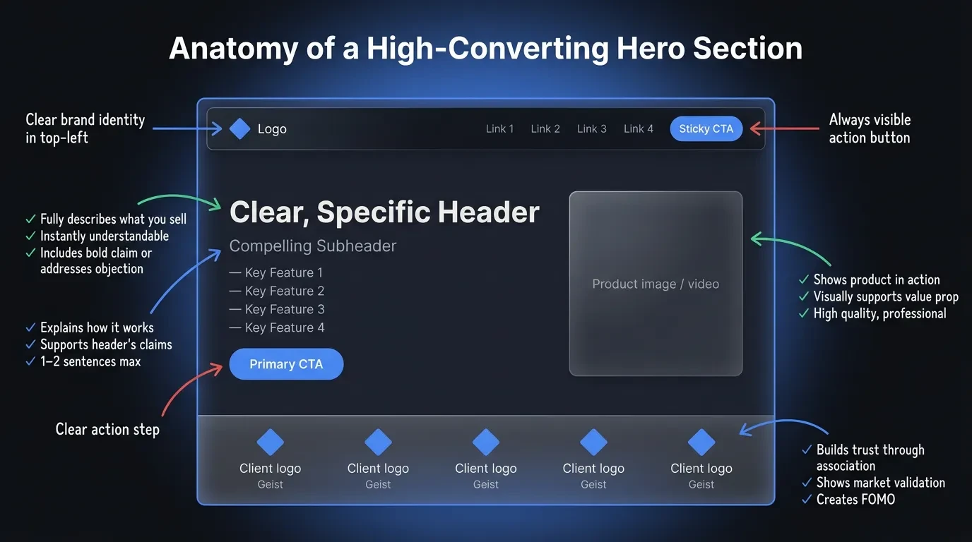
The order matters as much as the parts. A visitor reads top to bottom, so the headline carries the weight and everything beneath it removes a reason to leave. Miss one element and the visitor fills the gap with doubt.
It also matters what you leave out. A cluttered navigation bar, an autoplaying carousel, and a cookie wall stacked over the headline all steal attention from the one action you want. Cut anything in the hero that doesn't help the visitor decide.
This is an anatomy, not a template. A jewelry brand selling on emotion can lead with the image and shrink the headline to a few words. A B2B tool selling on logic needs the headline to do the heavy lifting. The five parts stay the same — their balance shifts with what you sell and who's buying.
Write the Headline Before You Touch the Image
The biggest mistake I see is designing the visual first and forcing words to fit it. Start the other way around. Lock the message before a single colorful pixel goes on screen.
At Vediwood we draft landing pages as a plain, unstyled layout with the real headline and subhead already written in. It keeps the conversation on what the page says, not how it looks, and it stops the copy from becoming an afterthought wrapped around a pretty picture.
A simple formula gets most headlines 80% of the way: outcome, plus audience, plus a reason to believe. "Bookkeeping built for restaurant owners — closed and reconciled by the 5th" beats "Financial clarity for modern teams" because it names who it's for and what they get. Write three to five versions and read each one aloud.
The headline test is simple. Read it alone — no image, no logo, no surrounding context. If a stranger can't tell what you do and why it matters, the headline isn't finished.
Then match the headline to its source. If an ad promised bookkeeping for restaurants, the hero should echo that promise, not pivot to a broader brand statement. Every word of distance between the ad and the hero is a reason to bounce, and on paid traffic that distance is money you already spent.
One Hero, One Job: Make the CTA a Single Choice
Every extra option in a hero costs you focus. A visitor choosing between Buy now, Learn more, Watch demo, and Join our newsletter often chooses nothing at all. Give the hero one job and one button to do it.
The reason is simple: more choices mean more thinking, and thinking on a landing page is friction. A visitor who has to weigh four actions is a visitor who can defer the decision by leaving. One clear path keeps the momentum the headline just built.
When you genuinely need two paths, rank them. Make the primary CTA solid and high-contrast, and let the secondary one sit quietly as a text link or outline button. The visitor should never have to wonder which action you actually want.
Write the button like an action, not a label, and add one line of microcopy underneath to clear the last hesitation — "No card required," "Cancel anytime." That single line often does more for conversion than the button color everyone argues about.
This is also the cheapest test on your site. Rewriting a single CTA takes minutes and often moves conversion more than a full redesign does.
In 2026, a Slow Hero Is a Lost Sale
Your hero is usually the first thing a visitor waits for and the first thing Google measures. The large image or headline at the top is often your Largest Contentful Paint — the moment the main content becomes visible. If it loads slowly, both the visitor and your ranking pay for it.
Google's guidance is specific: aim to have Largest Contentful Paint occur within 2.5 seconds for a good score (Google Search Central, 2026). A heavy hero video or an uncompressed background image is the fastest way to miss that mark.
Most slow heroes share the same culprits: a multi-megabyte background image, an autoplaying video, a slider that loads five slides when the visitor only sees one, and custom fonts that block the headline from rendering. Each one delays the exact content you need the visitor to see first.
The fixes are mechanical, not creative. Compress and properly size the hero image, serve modern formats like WebP, lazy-load anything below the fold, preload the hero image, and never let a background video block the headline and CTA from rendering. Measure the result with a free tool like PageSpeed Insights before and after.
Speed isn't a developer's vanity metric — it's the first conversion lever. A visitor who waits three seconds for your headline has already started forming the thought that this isn't worth it.
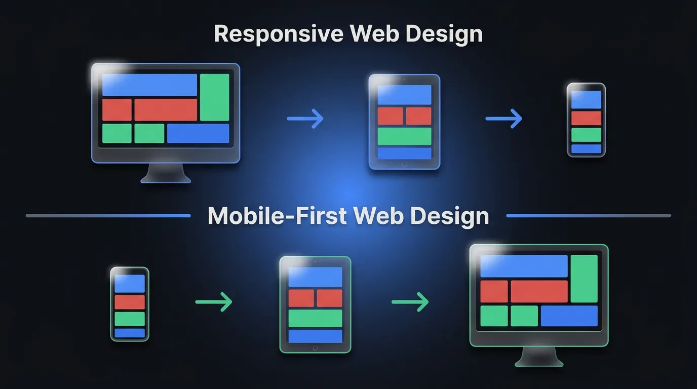
Your Hero Has to Work on a Phone First
Most of your traffic is on mobile, yet most heroes are still designed on a desktop canvas and squeezed down afterward. That's backwards. Design the hero for the small screen first, then let it expand.
On a phone, side-by-side layouts have to stack. Decide the order now — headline, subhead, CTA, then visual, or visual first if the image is the emotional hook. Don't let the framework guess for you, because that's how the headline ends up buried below the image.
Size for thumbs. Keep the primary CTA large enough to tap easily and place it high enough to be visible without scrolling on a typical phone. Scale the headline down so it stays two or three lines, not eight, and make sure body text never drops below a comfortable reading size.
Watch what collapses. Logo rows and star ratings that read as trust signals on desktop often shrink into illegible clutter on mobile, so simplify them rather than cramming them in.
Then test on a real device, not just a browser resize. A hero that looks balanced on a 27-inch monitor can push its CTA three scrolls down on a phone — and that's where the sale quietly disappears.
Five Hero Patterns That Quietly Kill Conversions
Some heroes don't just underperform; they actively work against you. These are the patterns I flag first in any review.
The rotating carousel is the worst offender. Visitors rarely wait for slide two, the auto-rotation moves the message before they finish reading, and it drags down load time — three losses for one feature.
An autoplaying video with sound is close behind. It hijacks attention, eats bandwidth on mobile, and often hides the headline behind a play state the visitor has to dismiss.
A generic stock-photo hero quietly erodes trust. A handshake or a smiling headset agent that's visibly stock tells the visitor "we couldn't be bothered to show the real thing," and trust drops fast.
The last two are silent: a CTA that only appears after a scroll, and a headline that names the product rather than the outcome. Both leave the visitor doing work the hero was supposed to do for them.
How to Tell If Your Hero Is Quietly Costing You Sales
Start with the five-second test. Show the hero to someone unfamiliar with your business for five seconds, then ask what you do and what they'd click. If they can't answer, neither can your visitors.
Attention is front-loaded. Nielsen Norman Group found users spend about 57% of their viewing time above the fold (Nielsen Norman Group, 2018). The hero isn't one section among many — it's where most of the decision happens.
Read your analytics next. A high bounce rate, or visitors leaving without scrolling past the first screen, is a strong signal the hero isn't doing its job. Session recordings and heatmaps then show you exactly where attention dies.
You can also just ask. A one-question on-page survey — "Is there anything stopping you from signing up today?" — surfaces the doubts your hero failed to clear, in the visitor's own words.
After that, change one thing at a time. Test a new headline against the old one on real traffic before touching the layout, so you learn what actually moved the number. A redesign without a hypothesis is a coin flip with your revenue.
Build a Hero That Earns Its Place
A hero section is the highest-impact screen on your site. It gets the most attention, sets the message, and decides whether the click you paid for turns into a customer. Treat it as a business decision, not a finishing touch.
If you're weighing whether your current site is holding your business back, see how Vediwood approaches web design and build — message, performance, and conversion handled from the ground up, with the reasoning behind every decision written down.
Follow Us
Most founders read us once and change something that week.
Every issue covers one thing that makes your website work harder — better conversion, stronger SEO, or smarter design. No fluff, no agency speak. Just the decision you need to make this week.
Our Team

Sadiki Said
Full Stack Developer

Nezha Essyed
Content Strategist