Color Psychology for Website Conversions: 2026 Guide
Your website colors send a trust signal to every visitor before they read a word — and the wrong ones quietly cost you sales. This is the founder's guide to choosing colors that convert, using contrast rules, real psychology, and your own data instead of guesswork.

Yes — the colors on your website affect your conversions, just not the way most articles promise. Color psychology for website conversions is real, but it has almost nothing to do with finding one "magic" high-converting color and everything to do with trust, contrast, and matching your palette to what you charge. I've rebuilt enough sites to watch a single color change lift a conversion rate, and watched founders burn weeks testing button colors that were never the problem. This is the founder's version: what color actually does to a visitor, which choices build trust, and how to prove what works on your own site. No design degree required.
Does Color Psychology Actually Change Website Conversions?
Color changes conversions because it changes how a visitor feels before they think. Researchers found people form a first opinion about a product within 90 seconds, and as much as 90% of that snap judgment comes from color alone (Satyendra Singh, Management Decision, 2006). That reaction lands before your headline, your offer, or your testimonials get a single vote.
Here is the part most guides get wrong. Color rarely works as a standalone lever you can pull for an easy win. A blue button does not "convert better" than a green one under some universal law — the tests that claim it are almost always measuring contrast, not the colour itself.
Take the HubSpot button test that gets quoted everywhere. A red call-to-action beat a green one by 21%, and the internet decided red converts. But the red button was the only warm element on an otherwise green page. It won because it stood out — not because red is magic.
The same logic explains why warm CTAs often edge out cool ones in e-commerce by a point or two. On a typical product page full of blues, greys, and photography, a warm orange or red is simply the highest-contrast thing on the screen. Move that same button onto an orange page and the effect disappears.
So yes, color affects conversions — as a system, not a trick. Trust, visual hierarchy, and contrast either pull in the same direction or fight each other. Treat color as a system and it becomes one of the cheapest performance gains you can make; treat it as a hunt for the perfect hex code and you'll spend weeks fixing the wrong thing.
How Color Works on a Visitor Before They Read a Word
Your visitor's brain processes color before it processes language. People read images — including color and contrast — far faster than they read text, which is why a page "feels" a certain way the instant it loads. By the time someone reads your first line, color has already set the mood they read it in.
That mood is doing one job above all: pattern-matching for safety. The brain is quietly asking whether this looks like a real business, whether it feels like it's "for me," and whether anything here signals risk. Color is one of the loudest inputs into that judgment, and the whole check happens in under a second.
This is why a mismatched or chaotic palette costs you before you've said anything. A site that looks slapped together raises a subconscious flag — if they don't care how this looks, do they care about the product? It's the digital equivalent of walking past a restaurant with a grimy front window.
There's also a compounding effect most founders miss. When your palette is consistent across your site, ads, emails, and social, people start to recognise you by colour — and recognition is itself a trust signal. A visitor who saw your warm-orange ad should land on a warm-orange site, not a cold blue one, or the disconnect quietly wastes the click you already paid for.
The practical takeaway is simple. Color is not decoration you bolt on at the end; it's the first argument your site makes. Get that emotional first impression right and every other element — your copy, your proof, your price — gets a fairer hearing.
Color, Trust, and Why Your Palette Has to Match Your Price
The most commercially important thing color does is signal credibility — and it's the part founders underestimate most. Online, a visitor can't shake your hand or read the room. They judge whether to trust you almost entirely on digital signals, and your palette is one of the loudest.
There's a reason banks, insurers, and healthcare brands lean on blue. Blue reads as calm, stable, and dependable, which is exactly what someone wants to feel before handing over money or personal data. If trust is your primary selling point, building blue or deep navy into your palette is a smart, low-risk move.
But trust isn't one color — it's coherence. The bigger mistake I see is a palette that contradicts the price. If you charge premium prices on a website that looks like a discount brand, you open a gap the visitor feels as suspicion, not value.
Picture two service firms. A law firm running deep navy, warm gold accents, and generous white space reads as senior and safe — worth the fee. The same firm in bright primary colors and a busy layout reads as a side hustle, no matter how good the lawyers are. The colors set the price expectation before the visitor reaches your rates.
Premium positioning usually calls for restraint: deep navies, rich blacks, warm metallics, and plenty of white space. Accessible, high-volume brands can run brighter and louder — bold oranges, energetic yellows, high-saturation greens. Neither approach is wrong; the failure is when your colors say "cheap" and your checkout says "premium," or the reverse.
So before you pick a single shade, answer one question honestly: does this palette match what I'm actually charging? Get that alignment right and color stops quietly arguing against your pricing.
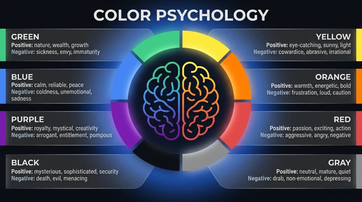
What Each Color Signals: The Founder's Quick Guide
You don't need the full color wheel; you need to know what each major color tends to say so you can choose on purpose. These associations aren't universal laws — they shift across cultures — but they're consistent enough in Western markets to guide a confident first draft. Use them as a starting point, then test.
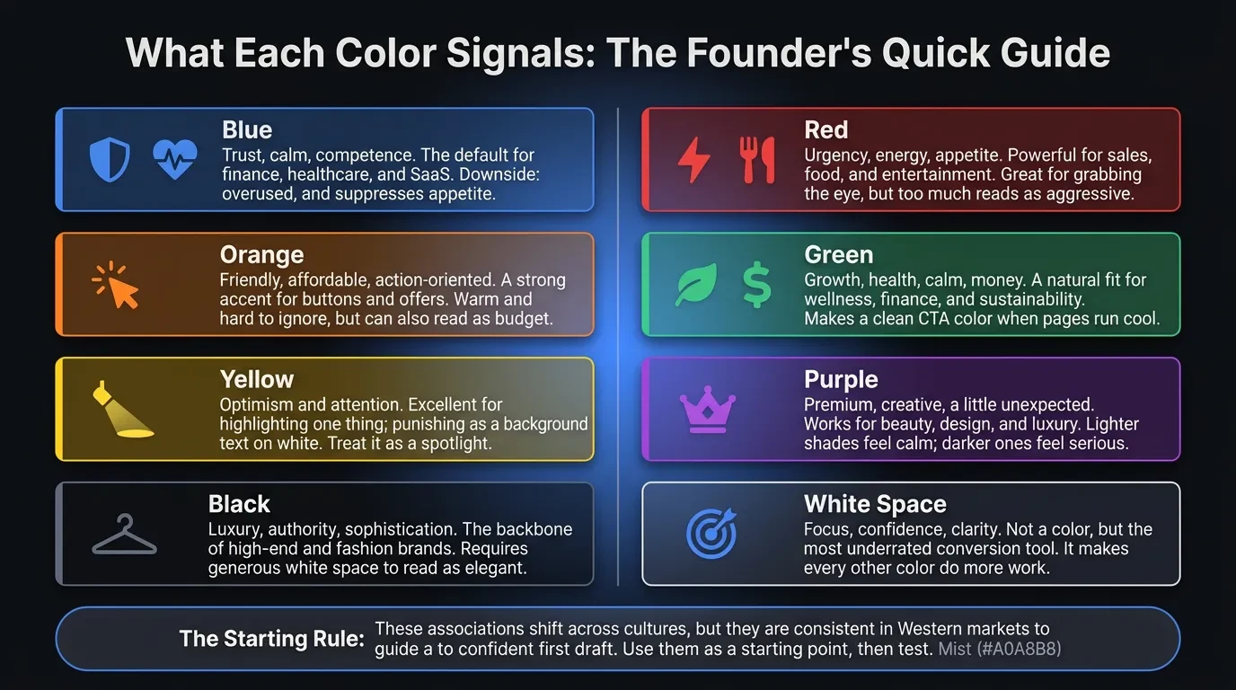
- Blue — trust, calm, competence. The default for finance, healthcare, and SaaS, and anything where safety sells. Downside: overused, and it suppresses appetite, so avoid it for food.
- Red — urgency, energy, appetite. Powerful for sales, food, and entertainment, and great for grabbing the eye. Use it in small doses; too much reads as aggressive or alarming.
- Orange — friendly, affordable, action-oriented. A strong accent for buttons and offers because it's warm and hard to ignore. It can also read as "budget," so match it to your positioning.
- Green — growth, health, calm, money. A natural fit for wellness, finance, and sustainability. It also makes a clean CTA color when the rest of the page runs cool or neutral.
- Yellow — optimism and attention. Excellent for highlighting one thing; punishing as a background or as text on white. Treat it as a spotlight, not a wall.
- Purple — premium, creative, a little unexpected. Works for beauty, design, and luxury. Lighter shades feel calm; darker ones feel serious.
- Black — luxury, authority, sophistication. The backbone of high-end and fashion brands. Use white space generously so it reads as elegant, not heavy.
- White space — not a color, but the most underrated conversion tool you have. It creates focus, signals confidence, and makes every other color do more work.
Here's the rule that matters more than any single entry. Pick one dominant color, one accent for action, and let neutrals carry the rest. A reliable split is roughly 60% dominant, 30% secondary, and 10% accent — and that 10% is where your buttons live.
To choose your dominant color, start from the emotion you want, not the shade you like. Ask what your ideal customer needs to feel in the first second — safe, excited, calm, impressed — then work back to the colour that creates it. Your personal favourite is a starting point, never the strategy.
The Truth About CTA Button Colors
The most common color question I get is "what's the best color for a button?" — and it's the wrong question. There is no universally best-converting button color. Every credible test that "proves" one is really proving that the winning button had the most contrast against its surroundings.
Your call-to-action is the single most important element on most pages, so it has one job: to be impossible to miss. That means it shouldn't share a color family with everything around it. A button converts when it's the loudest thing on the screen — not when it's a specific shade.
The practical version: choose a CTA color that clashes pleasantly with your dominant palette. Cool blue-and-grey site? A warm orange or green button jumps out. Dark, moody design? A bright white or gold button does the same. The worst CTA is one camouflaged in your brand color because it "matches" — I've watched a perfectly good offer underperform purely because the button was the same blue as the header.
Two more things multiply the effect. Surround the button with white space so the color has room to breathe, and keep one primary action per screen — competing buttons cancel each other out. Don't forget the button text, either; light text on a dark button (or the reverse) has to clear the same readability bar as the rest of your page.
Finally, keep the CTA color consistent across the site. When the same accent always means "click here," you train visitors to find your conversion points without thinking. Consistency turns color into a habit, and habits convert.
Contrast and Accessibility: The Part Almost Everyone Skips
Here's what the other guides leave out: the color rule with the most direct line to conversions isn't psychology, it's contrast. If text and buttons are hard to read, it doesn't matter what they "mean" — people leave. Low contrast is one of the quietest conversion killers there is.
There's a published standard for this. The WCAG 2.1 guidelines set a minimum contrast ratio of 4.5:1 for normal text and 3:1 for large text against its background (W3C, WCAG 2.1). Pale grey text on white fails it, looks "designy" on your screen, and costs you readers — especially on a phone in daylight, which is where a lot of your traffic actually is.
This is also a legal issue, not just a usability one. Web accessibility complaints over unreadable, inaccessible sites have climbed year after year, and low color contrast is one of the most commonly cited failures. Meeting contrast standards protects your conversions and your business at the same time.
Accessibility isn't a niche concern, either. Roughly 1 in 12 men has some form of color blindness, so any design that uses color alone to carry meaning — a red "error" with no text, a green "success" with no icon — fails a real slice of your audience. Always pair color with a label or an icon.
The fix is cheap. Run your palette through a free contrast checker before launch, make sure your CTA passes against its background, and test the page on an actual phone outdoors. Readable beats beautiful every time a visitor is trying to act.
The 2026 Color Trends Worth Knowing (and the Ones to Ignore)
Color trends move, and 2026 has a clear direction: warm, grounded, and human. Pantone's recent Color of the Year, Mocha Mousse — a soft, earthy brown — set the tone, and you'll see warm neutrals, clay, and muted earth tones pushing out the cold tech-blue-and-grey look (Pantone). For founders, this matters because warmth currently reads as trustworthy and approachable.
At the same time, "dopamine" palettes — bright, high-saturation pops of color — are everywhere, used as accents against those calmer neutrals. The combination is the real trend: a grounded base carrying one energetic, joyful accent that does the heavy lifting on your call to action.
Dark mode is the other shift you can't ignore. More visitors browse in dark themes, so your palette has to survive on a dark background, and your contrast ratios need to hold both ways. Test your site in light and dark before you call it finished.
Here's what to ignore: any trend that fights your brand or your readability. A palette that's on-trend but off-brand converts worse than a plain one that's clear and consistent. A wellness brand chasing a neon dopamine look can easily lose the calm that made people trust it in the first place.
Borrow the mood of the moment; don't let it overrule the fundamentals. Trends are a layer of polish on top of trust, contrast, and consistency — never a replacement for them.
Common Color Mistakes That Quietly Kill Conversions
Most color problems aren't exotic. They're the same handful of mistakes repeated across thousands of sites, and these are the ones I fix most often:
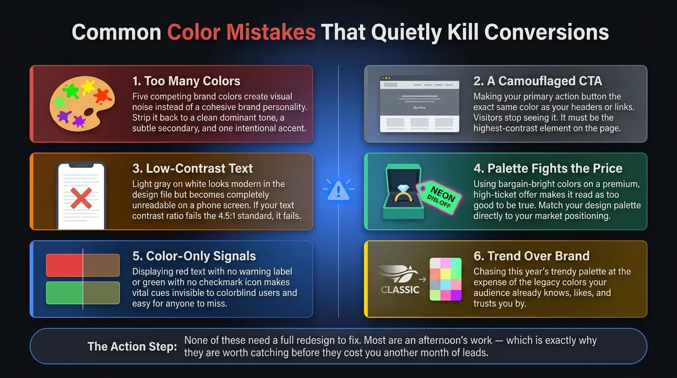
- Too many colors. Five competing brand colors create noise, not personality. Cut down to a dominant, a secondary, and one accent.
- A camouflaged CTA. If your button is the same color as your header or your links, visitors stop seeing it. Make it the highest-contrast element on the page.
- Low-contrast text. Light grey on white looks modern in the design file and unreadable on a phone. If it fails 4.5:1, it fails.
- A palette that fights the price. Bargain-bright colors on a premium offer read as "too good to be true." Match the palette to the position.
- Color-only signals. Red text with no label, green with no icon — invisible to colorblind users and easy for everyone to miss.
- Trend over brand. Adopting this year's palette at the expense of the colors your audience already knows you by.
None of these need a full redesign to fix. Most are an afternoon's work — which is exactly why they're worth catching before they cost you another month of leads.
How to Test Color on Your Own Site Instead of Guessing
Every rule above is a starting point — your conversion data is the judge. The mistake founders make is treating color advice as gospel instead of a hypothesis. What works for a law firm's audience may flop for a skincare brand's, and the only way to know is to measure on your own traffic.
Start by looking before you change anything. A high homepage bounce rate often points to a jarring first impression, and a low click-through on your main CTA usually means the button isn't standing out. A heatmap tool will show you fast whether people even see your call to action. Those signals tell you whether color is your problem at all.
Then test one thing at a time. Change the CTA contrast, or the dominant palette, or the hero background — but only one variable per test, or you won't know what moved the number. Run each test long enough to reach a real sample, not a good Monday. A few hundred conversions per variation is a sensible floor before you trust a winner.
Use the free tools first. A contrast checker, your analytics, a simple A/B split in your site builder, and a heatmap will answer most colour questions without a budget. You don't need expensive software to make better decisions — you need one clear change and one clear metric.
Keep what wins and write it down. Over time you build a palette that's proven on your audience, not borrowed from an article. That's the whole difference between color as decoration and color as a conversion tool.
Get a Second Opinion on the Colors Costing You Conversions
If you've read this far, you probably suspect your own palette is doing some quiet damage — the wrong trust signal, a button that blends in, text no one can read on a phone. Most of these are fixable in a focused redesign, not a full rebuild. The hard part is seeing your own site clearly.
That's the kind of work we do at Vediwood: we rebuild sites where design decisions are working against the business, and we explain every choice so you know why it converts. If you want an honest read on whether your colors are helping or hurting, book a call — no pitch, just a straight answer.
Follow Us
Most founders read us once and change something that week.
Every issue covers one thing that makes your website work harder — better conversion, stronger SEO, or smarter design. No fluff, no agency speak. Just the decision you need to make this week.
Our Team

Sadiki Said
Full Stack Developer

Nezha Essyed
Content Strategist