
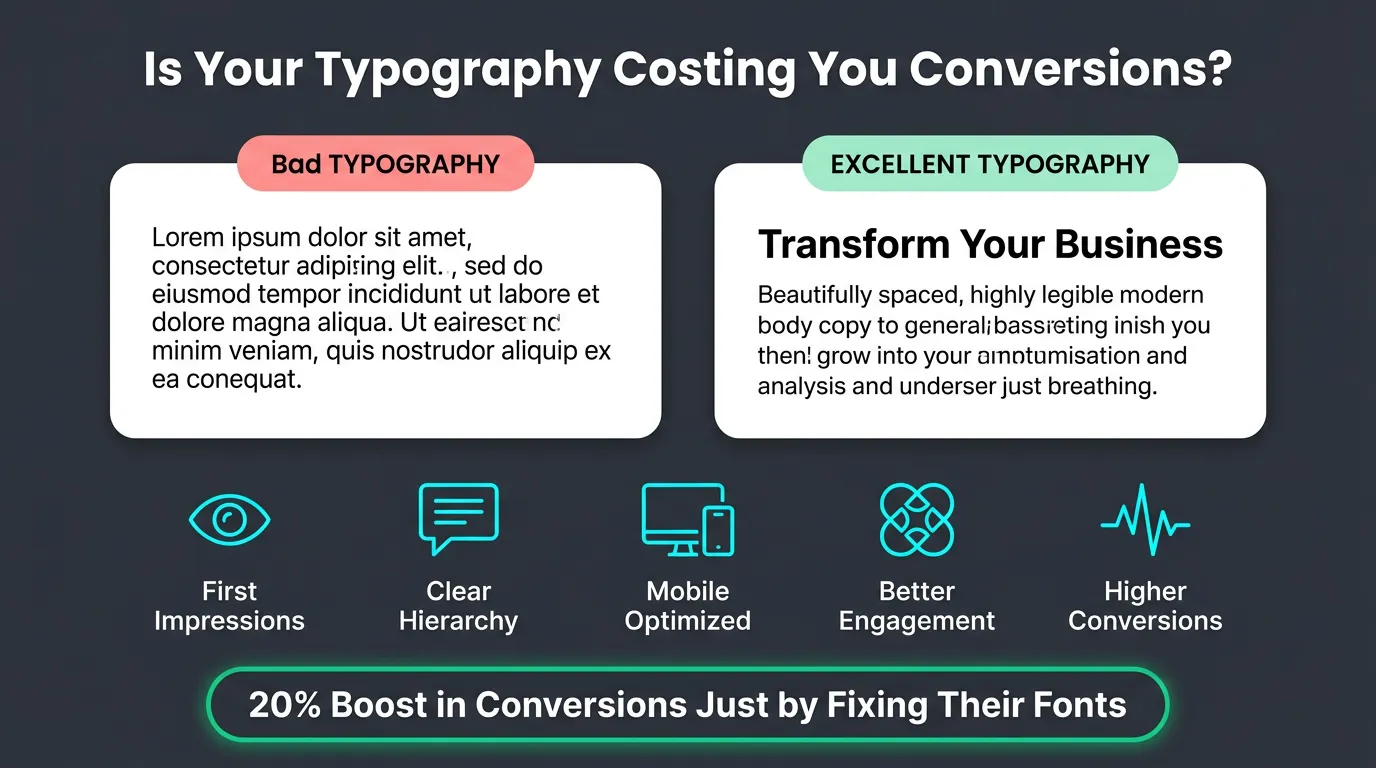
Your website is losing sales right now — and the cause probably isn't your pricing, your offer, or your traffic. Typography for website conversions is the single most underestimated lever on any business site — and most founders have never given it a deliberate thought.
One documented case study showed that a single change — increasing body font size combined with adjusted line spacing — reduced bounce rate by 10%, cut exit rate by 19%, increased pages per session by 24%, and lifted form conversion rate by 133%. Same copy. Same layout. Same offer. Different typography.
This guide is for business owners and founders who want to understand exactly how typography affects conversions, which specific decisions move the needle, and what to change this week.
What Typography for Website Conversions Actually Means
Typography for website conversions means making deliberate decisions about fonts, sizes, spacing, and hierarchy — specifically to guide visitors toward taking action.
Most business owners treat typography as a design preference. Pick a professional-looking font, make headings bigger than body text, move on. That approach leaves real revenue on the table every day.
Every typography choice is a reading experience choice. If your text is hard to read, visitors leave. If your hierarchy is unclear, they don't know where to look. If your CTA button text carries the same visual weight as your body copy, it doesn't register as the priority — and it doesn't convert. None of that is about aesthetics. It is about behaviour.
Typography for conversions is the practice of removing every friction point between a visitor and the action you want them to take.
How Typography Affects Conversions: What the Research Shows
The link between typography and conversion rate is not obvious — so it helps to understand the mechanism before moving to tactics.
Font choice shapes perceived trustworthiness
A Stanford Web Credibility Study found that 46.1% of consumers judge website credibility based on its visual design — including typography, layout, and colour. Credibility is a prerequisite for conversion. If your font signals "amateur" or "cheap," visitors don't buy, regardless of how strong your offer is.
Serif fonts (Georgia, Playfair Display, Merriweather) carry associations with authority, tradition, and credibility. They perform well for financial services, legal firms, premium brands, and any context where trust is the primary conversion trigger. Sans-serif fonts (Inter, Helvetica, DM Sans) signal modernity, clarity, and efficiency — they dominate in tech, SaaS, and e-commerce, and are consistently rated as more readable on screens at body-text sizes.
The choice between them is not a preference decision — it is a question of what emotion your buyer needs to feel before they will convert.
Readability controls time-on-page — and time-on-page controls conversions
Visitors don't read websites the way they read books. They scan. They jump between headings, pause on bolded phrases, and only slow down when something earns their attention. Poor typography breaks that scanning rhythm.
Text that's too small, too tight, or spanning too wide per line forces the eye to work harder. The brain registers friction. The visitor leaves. Research from MIT (2018) shows that well-structured typography can improve reading comprehension by up to 20%. That compounds: a visitor who understands your offer better is more likely to convert.
Time-on-page is not a vanity metric — it is a direct conversion signal, and typography controls it.
Visual hierarchy steers the eye toward your CTA
Every page has a job, and that job ends at a conversion point. Typography creates the visual path that leads there.
When hierarchy is broken, every element competes for attention equally. Your headline, subheading, body copy, and CTA button all carry similar visual weight. Visitors don't know what matters most. They hesitate, scan without direction, and leave.
Correct hierarchy — clear size and weight differences between H1, H2, body text, and CTA — tells visitors exactly where they are, what to read next, and where to go. It makes the conversion path obvious without a single extra word of copy.
The 5 Typography Variables That Directly Affect Conversions
These are the five decisions that matter most. Each one is specific, measurable, and changeable without a full redesign.
1. Font pairing: heading vs body
Use two fonts. Not three, not four — two.
The heading font carries personality and brand signal. It creates the first emotional impression. The body font carries information — its only job is to be readable. These requirements are often in tension, which is why they belong on different typefaces.
A reliable pairing that converts: a distinctive serif for headings (Playfair Display, Lora) and a neutral sans-serif for body (Inter, DM Sans). The contrast creates visual interest without confusion. If you're uncertain, Inter used at both heading and body sizes — with clear size and weight differentiation — is cleaner than two poorly-matched fonts. Coherence always beats variety.
2. Font size: most websites are too small
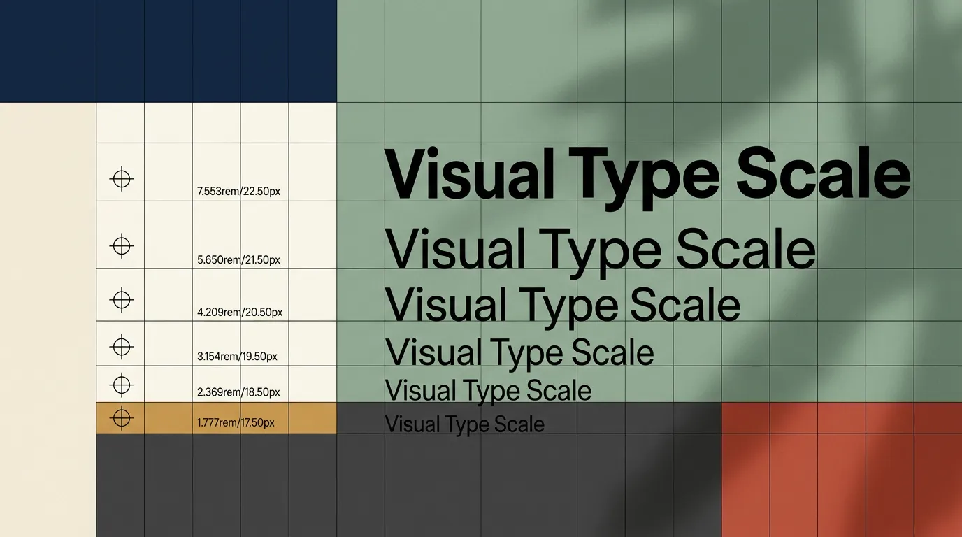
Minimum body text size for desktop: 16px. Recommended: 18–20px.
Most websites built before 2022 use 14–15px body text. In 2026, with high-DPI screens, wider buyer demographics, and mobile-first behaviour, 14px body text is a conversion liability.
Specific size targets that apply to almost every business website:
- Body text: 16–20px
- CTA button text: 18–22px, bold — never smaller than body copy
- H1 headlines: 36–52px on desktop, 28–40px on mobile
- H2 subheadings: 22–30px on desktop
The fastest, highest-ROI typography change any website owner can make today: increase body font size to 18px. One line of CSS. Almost always a conversion improvement.
3. Line length: the 60-character rule
Optimal reading line length is 50–75 characters per line — roughly 8–12 words. Shorter creates a choppy, fragmented reading rhythm. Longer forces the eye to travel too far, making it difficult to track back to the start of the next line.
Most full-width websites violate this immediately. A paragraph spanning 1,440px at a standard font size can hit 140+ characters per line. Readers lose their place. They skim less effectively. They retain less. They convert less.
The fix is straightforward: constrain your content column width. In CSS, max-width: 70ch on body text containers is the correct approach. This is one of the highest-ROI typography changes a developer can make — it costs nothing to implement and improves every page simultaneously.
4. Line height: the space that keeps readers reading
Line height — the vertical space between lines of text — is almost always set too tight on sites not built by typography-aware designers.
Default browser line-height is 1.0 to 1.2. Fine for print. On screens, it reads as compressed and dense. Dense text signals effort. Effort signals friction. Friction kills conversions.
Recommended line-height: 1.5–1.6 for body text, 1.1–1.3 for headings. Setting line-height: 1.6 on your body text — one CSS property — makes any website feel more readable, more airy, and more professional.
5. Contrast: most websites fail the legal standard
Web Content Accessibility Guidelines (WCAG) AA requires a minimum 4.5:1 contrast ratio for normal text and 3:1 for large text (18px+ regular or 14px+ bold). That is not a design preference — it is a legal standard in many jurisdictions, and a component of Google's Core Web Vitals accessibility scoring.
Grey text on white backgrounds is the most common failure. Text overlaid on photographs without a dark overlay is the worst case. Low contrast doesn't just affect accessibility — it reduces the speed at which visitors read your copy, which reduces comprehension, raises bounce rate, and decreases conversions.
Use WebAIM Contrast Checker (webaim.org/resources/contrastchecker) — it's free and takes 30 seconds. Enter your text and background hex codes. If your body text fails 4.5:1, fix this before anything else.
Typography for CTAs: The Most Overlooked Conversion Lever
Your call-to-action is where everything converges. The typography of your CTA — and the copy immediately above it — is where most businesses lose conversions they have already earned.
Bold weight only. CTA button text should be 600 weight (semi-bold) at minimum — 700 (bold) is better. It needs to visually separate from body copy at a glance. If your CTA text carries the same weight as the surrounding paragraph, it blends in and does not convert.
18–22px minimum. Never let CTA text drop below 18px. On mobile, accurate thumb-tapping requires both adequate font size and tap-target space. Google recommends a minimum tap target of 48×48px for any interactive element.
Sentence case, not all-caps. Research consistently shows all-caps text is read 13% slower than mixed-case (Tinker, 1955, replicated across multiple UX studies). All-caps may feel bold. It actually reduces comprehension speed. Sentence case converts better.
The headline immediately above your CTA matters as much as the button text itself. It is the last copy a visitor reads before deciding whether to act. If that headline carries the same visual weight as body text — same size, no emphasis, no visual break — it does not carry the impact the moment demands.
One practical test: cover your CTA button and look only at the headline above it. Does that headline alone make you want to act? If not, your typography is not doing the conversion work it should be.
Mobile Typography: Where Most Websites Lose the Sale
Over 60% of all web traffic now comes from mobile devices (Statista, 2025). This is where most typography failures live — because most websites were designed on desktop and scaled down, rather than designed mobile-first.
Scaling down is not the same as designing for mobile. A 48px desktop headline becoming 28px on mobile is acceptable. But body text that reads clearly at 18px on a 1,440px monitor can compress to 11–12px on a 390px phone after proportional layout scaling. That is illegible.
Mobile typography non-negotiables:
- Body text: 16px minimum (iOS auto-zooms any input with font-size below 16px, breaking the entire user flow)
- Headlines: 28–36px
- CTA text: 18–22px
- Line-height: 1.5–1.6 — more important on small screens, not less
- Tap targets: 48×48px minimum for any interactive element
One mobile-specific failure to watch for: text links styled only with a colour change — no underline, no size difference — are missed on mobile. They're nearly invisible during a scan and easy to mis-tap. If a link is in your conversion path, it needs to be visually and physically obvious.
Never audit your mobile experience using browser responsive mode. Read your landing page on a real phone. Tap your primary CTA with your actual thumb. If either requires deliberate effort, you have a mobile typography problem losing you conversions today.
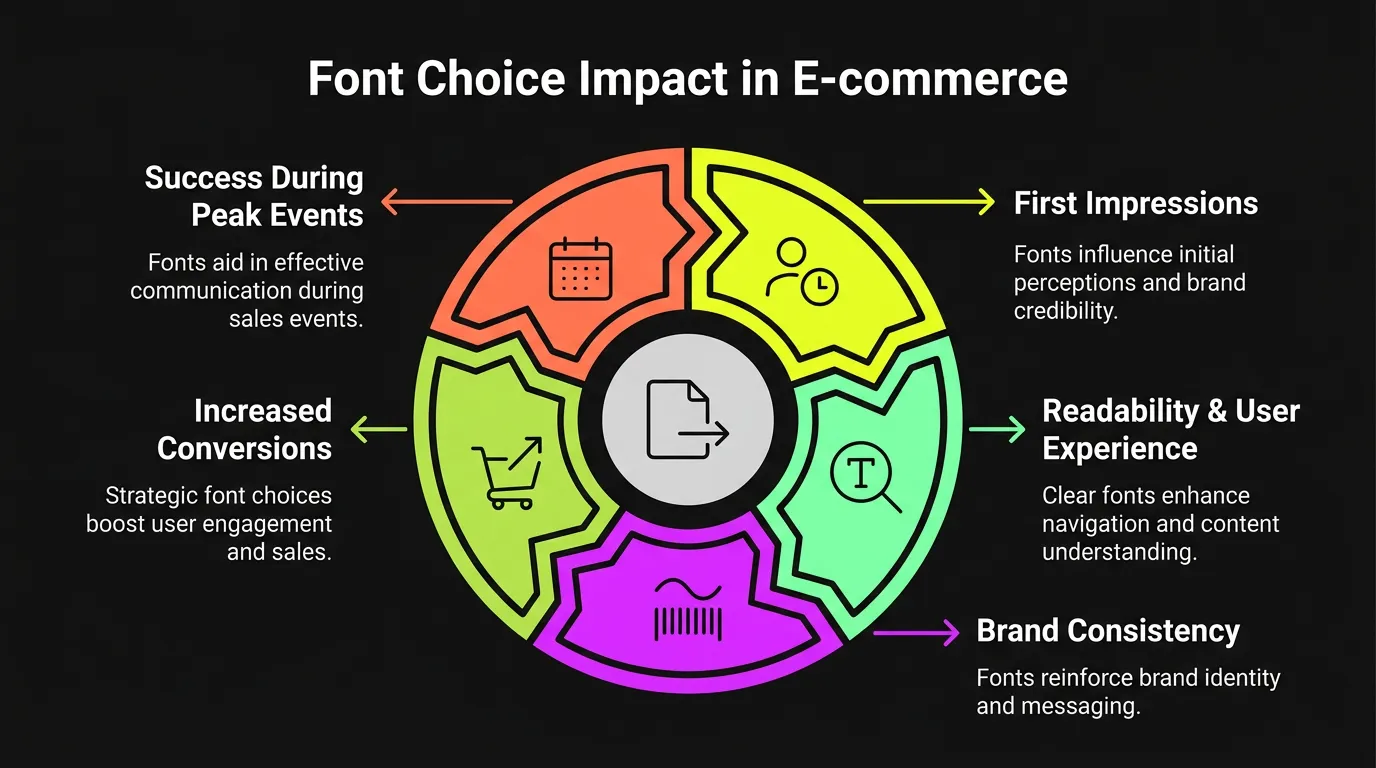
Typography by Business Type: What Works for Your Category
Typography decisions are not one-size-fits-all. What converts for a SaaS product differs from what converts for a boutique consultancy or an e-commerce brand. Here is what matters most, by business type.
SaaS and technology businesses
Sans-serif fonts dominate this space for a clear reason: they signal modernity, efficiency, and technical credibility. Inter has become the de facto standard for product interfaces and SaaS marketing sites — it was built specifically for screens, with letter spacing, proportions, and weight distribution optimised for interfaces rather than print.
For SaaS, hierarchy is the primary conversion variable. Your visitor is evaluating whether your tool solves a specific problem fast. The headline must state the outcome, the subheading must explain the mechanism, and the CTA must make the next step obvious — each at a distinct visual weight. Any ambiguity in that hierarchy is a lost trial sign-up or demo request.
Body text at 17–18px, H1 at 44–52px, and a CTA that reads as visually isolated from surrounding copy: these are the non-negotiables for SaaS conversion pages.
Professional services and agencies
Trust is the primary conversion trigger for service businesses — and typography is one of the fastest trust signals a visitor processes, often before reading a single word.
Serif fonts used in headings (Playfair Display, Libre Baskerville) signal expertise, authority, and credibility. Paired with a clean sans-serif for body text (Inter, Source Sans), they create a visual language that communicates "experienced" without stating it. This combination consistently outperforms all-sans-serif configurations for service businesses selling engagements above £5,000.
Testimonial and case study sections deserve their own typographic treatment. Slightly larger font size, generous line-height, and clear attribution in a distinguishable weight. Social proof typography that blends into body copy reads as more of your own text — it loses the third-party credibility that makes it valuable.
E-commerce brands
E-commerce typography is less about credibility and more about momentum. A visitor who has decided to buy needs to complete that action without friction. Typography that slows them down loses the sale.
Product names should be bold and visually larger than supporting description text, even on listing pages. Price hierarchy must be unambiguous — your actual selling price needs to be the most visually prominent number on the page, not competing with a smaller crossed-out comparison figure or a fine-print shipping note.
On product pages, headline and CTA typography carry the conversion weight. Product description body text should be 16–18px, generous line-height, and left-aligned. Centred body text reduces reading speed and is almost never the right choice for e-commerce outside of very short pull-quotes.
Variable Fonts: The 2026 Performance Edge
Variable fonts are worth understanding if you are building or rebuilding a website in 2026.
A variable font is a single font file that contains an entire range of weights and styles — rather than requiring separate files for regular, bold, italic, and bold-italic. Where a traditional font stack might load 4–6 separate files, a variable font loads one. Popular variable font families like Inter Variable and Recursive deliver 30–40% smaller total font payloads compared to traditional multi-file stacks (Google Fonts documentation, 2025).
For business websites, this matters on two fronts. First, smaller font payloads mean faster page loads — and page speed is a direct Google ranking factor. Google's own research shows that every one-second delay in mobile load time reduces conversions by up to 20%. Second, variable fonts give designers finer control over weight and style, enabling more precise typographic hierarchy without adding file overhead.
If you are using Google Fonts, you are likely already loading variable fonts by default. If you are on a self-hosted legacy font stack, it is worth raising with your developer during the next performance optimisation pass.
How to Audit Your Website Typography in 15 Minutes
You don't need a designer to run this audit. You need a browser, a real phone, and 15 minutes.
Step 1 — Check body font size. Open your site in Chrome. Right-click any paragraph of body text and select "Inspect." Under the "Computed" tab, look for font-size. Below 16px needs to change. Below 15px is hurting you right now.
Step 2 — Run the contrast test. Go to webaim.org/resources/contrastchecker. Enter your text colour and background colour as hex codes. Normal body text must pass WCAG AA at 4.5:1. Failure means your copy is reducing comprehension on every page of your site.
Step 3 — Count characters per line. Paste a full line of body copy from your site into any character counter. Consistently above 80 characters means your line length is reducing readability and retention.
Step 4 — Check your line-height. In Chrome DevTools, inspect any body text paragraph and look in the Computed tab for line-height. Below 1.4 is too tight. Below 1.2 is a problem.
Step 5 — Run the 5-second hierarchy test. Look at your primary landing page for five seconds, then close the tab. Without looking back: What was the headline? What was the CTA? What was the core offer? If you cannot answer all three from memory, your hierarchy is not working. Visitors who fail this test leave — and do not return.
Step 6 — Test on a real phone. Read a full paragraph without zooming. Tap your primary CTA with your thumb. If either requires deliberate effort, you have a mobile typography problem costing you conversions today.
Common Typography Mistakes That Kill Conversions
These patterns appear consistently on business websites that underperform their potential.
More than two font families. Every additional font adds visual noise and reduces coherence. Three or more fonts signals a lack of design intention — and lack of intention signals lack of professionalism to the visitor.
Decorative fonts in body copy. Script, display, and novelty typefaces belong in logos and short accent text. At body-copy length, they reduce reading speed significantly and signal that aesthetics, not clarity, drove the decision.
Text over images without a contrast solution. A photograph behind text is a WCAG failure at most viewport sizes. Without a dark overlay, solid text background, or contrast-checked text-shadow, you will fail accessibility standards. Hoping the photo is dark enough is not a solution.
Default browser line-height left unchanged. Moving from 1.2 to 1.5 can make a mediocre site feel instantly more professional and readable. One CSS property. Thirty seconds to implement.
CTA text matching body copy in size and weight. If your button text blends visually into the surrounding copy, it does not register as a priority element. It does not convert.
Designing only on desktop without mobile testing. Browser responsive mode is not an accurate representation of the actual mobile experience. Until you have read your landing page on a physical device and tapped your CTA with your thumb, you do not know how it performs. Most business owners have never done this. Most business websites have mobile typography problems as a direct result.
Your Typography Is a Revenue Decision — Work with Someone Who Treats It That Way
Typography is not decoration. Every choice — font, size, spacing, hierarchy — determines whether your reader stays, understands, and acts, or leaves.
The fastest wins are almost always the simplest: increase body font size to 18px, set line-height to 1.5–1.6, constrain content column width to 70ch, pass the WCAG contrast test at 4.5:1, and make CTA text bold at 20px minimum. Those five changes alone can shift conversion metrics within a week. They cost almost nothing to implement.
If you want a full typography and conversion audit — or you're building a new website and want conversion-optimised design built correctly from the start — Vediwood designs exactly that. Every typography decision is intentional, documented, and tied to a conversion goal.
Follow Us
Most founders read us once and change something that week.
Every issue covers one thing that makes your website work harder — better conversion, stronger SEO, or smarter design. No fluff, no agency speak. Just the decision you need to make this week.
Our Team

Sadiki Said
Full Stack Developer

Nezha Essyed
Content Strategist