Mobile-First Website Design for Business: Worth It?
Most of your visitors arrive on a phone, but most of your sales still come from desktop — and that gap is costing you. This is the plain-English guide to mobile-first website design: what it changes, whether it's worth the rebuild, and where to start.

For most businesses, the majority of website visitors now arrive on a phone — and the majority of sales still happen on desktop. That gap is the entire reason mobile-first website design exists, and for most businesses it is worth doing. The question worth asking isn't whether mobile matters. It's whether your current site is quietly losing the people it already attracts, and what it actually takes to fix that.
This guide answers that as a business decision, not a design exercise. No jargon, no rebuild-for-the-sake-of-it.
Is Mobile-First Website Design Actually Worth It?
For most businesses, yes — but not for the reason you usually hear. The common pitch is "everyone's on mobile, so design for mobile." That's true, and it's also not a reason to spend money.
The real reason is the gap between traffic and revenue. Phones bring you the most visitors and the fewest completed sales. Mobile-first design is the fix for that specific gap — not a coat of paint.
When a phone visitor lands on a site that was designed for a 27-inch monitor and shrunk to fit, friction shows up everywhere. Buttons sit too close together. Forms ask for too much. The thing they came for is three scrolls down.
Each point of friction is a small reason to leave. On a phone, with one thumb and a distracted brain, "small reason to leave" usually wins. That is where the money leaks.
So the honest answer has a condition attached. If most of your traffic is mobile and your mobile conversion rate trails your desktop rate, mobile-first is one of the highest-return changes you can make. If you run a desktop-heavy B2B tool used by people at their desks all day, the calculation is different — and we'll cover that case directly later in this guide.
What "Mobile-First" Actually Means (and What It Doesn't)
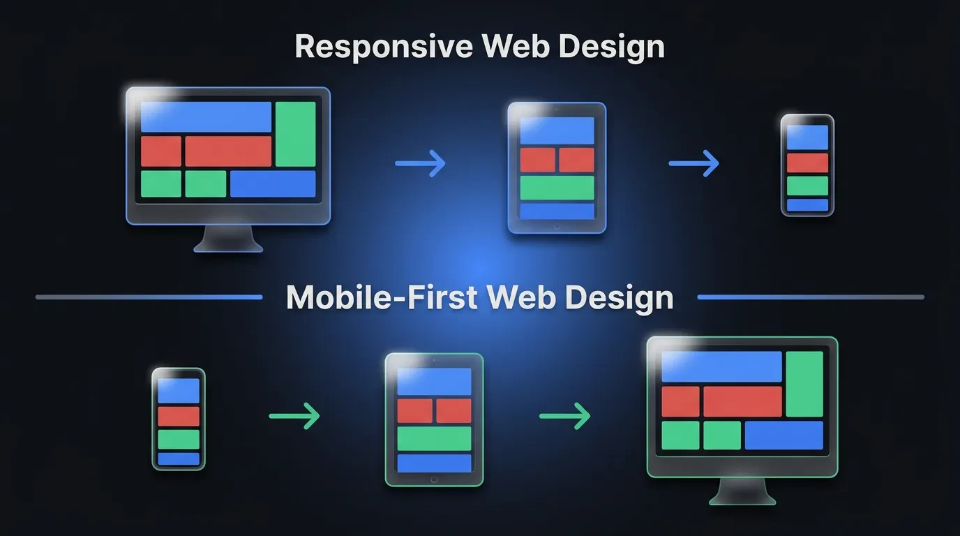
Mobile-first is a design order, not a device. It means you design and build the smallest screen first, then expand outward to tablet and desktop. You start with the hardest constraint and add room as you go.
Most teams do the opposite without thinking about it. They design the desktop version because that's the screen on their desk, then squeeze it down to fit a phone. The order you design in decides what survives the squeeze — and on a phone, only the essentials should.
This matters because of what each order forces you to confront. Start on desktop and you have endless space, so everything feels important. Start on mobile and you have a 6-inch screen, so you have to decide what the page is actually for.
That forced decision is the real value of mobile-first. It is less about phones and more about priority. One Reddit developer put it well: starting mobile-first "forces you to think about what's important instead of looking at the desktop and wondering how you'll cram it onto a phone."
Mobile-first is also not the same as "having a mobile version." Plenty of sites technically work on a phone and still feel like a chore to use. Working and being designed for the device are different things. The first clears a low bar. The second is what moves your numbers.
The Real Reason Mobile-First Matters for Business
Start with where your visitors actually are. Mobile devices generate the majority of all website traffic worldwide — consistently around 60% and climbing, according to Statista's tracking of mobile web traffic share. For many local and retail businesses, the real figure is higher.
Now look at where the sales are. Across e-commerce, mobile conversion rates have sat well below desktop for years — Statista's 2024 device data put mobile retail conversion near 2% against roughly 3% on desktop. More than half your traffic converts at two-thirds the rate of the smaller half. That is the gap mobile-first is built to close.
There's a second business reason, and it's structural. Google now indexes and ranks your site using the mobile version by default. This is called mobile-first indexing, and it has been Google's standard approach for years — confirmed in Google's mobile-first indexing documentation.
The implication catches people off guard. If your mobile experience is thin or slow, that's the version Google judges — even for the searches your desktop visitors run. A weak phone site can drag down rankings you assumed were safe.
Put the two together and the case writes itself. Mobile is where most people find you, where most people leave without buying, and where Google forms its opinion of your site. Improving it is rarely cosmetic. It's usually the cheapest lever you have on both traffic and revenue.
Mobile-First vs Responsive vs Mobile-Friendly
These three terms get used as if they mean the same thing. They don't, and the difference is exactly where money gets lost. Knowing which one you actually have tells you how big your problem is.
Mobile-friendly is the lowest bar. It means the site doesn't break on a phone — text is readable, nothing runs off the screen, you can tap things. A 2012 desktop site with a few fixes can be "mobile-friendly." It works. It rarely converts.
Responsive is the middle ground and where most sites sit today. The layout uses flexible grids that reflow to fit any screen, so one codebase serves every device. The catch is the starting point: responsive sites are usually designed desktop-first, then reflowed down. The mobile view is an adaptation, not a decision.
Mobile-first is the intent. The layout is still responsive — it still adapts to every screen — but the smallest screen drove the design choices. Content order, tap targets, and load speed were settled for the phone first, then expanded.
Here's the practical translation. Responsive guarantees your site fits a phone. Mobile-first guarantees your site was built for the person holding it. Most businesses have a responsive site they assume is mobile-first — and that assumption is the leak.
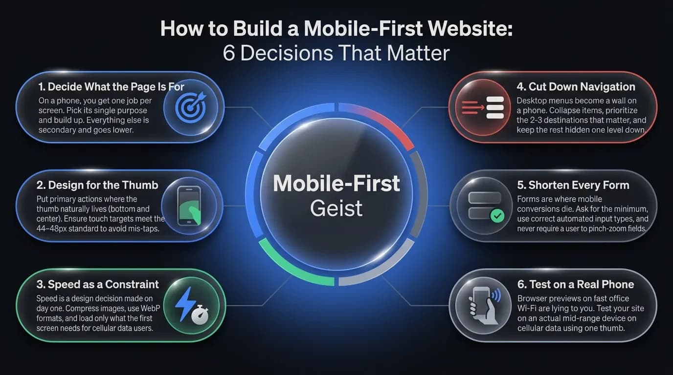
How to Build a Mobile-First Website: 6 Decisions That Matter
Mobile-first isn't a checklist of features. It's a sequence of decisions, made in the right order. Here are the six that move your numbers.
1. Decide what the page is for — before anything else
On a phone, you get one job per screen. Pick it. If it's a product page, the job is "see it, trust it, buy it" — everything else is secondary and goes lower. Strip the page back to its single purpose, then build up.
2. Design for the thumb, not the cursor
People hold a phone in one hand and tap with one thumb. The easy-to-reach zone is the bottom and center of the screen — the top corners are a stretch. Put your primary action where the thumb already lives, and give every tap target room. Apple and Google both recommend a minimum touch target of around 44–48 pixels, and crowded buttons are a top cause of mis-taps.
3. Make speed a design constraint, not a fix at the end
A phone on cellular data is slower than your office Wi-Fi, and your visitor's patience is shorter. Compress images, use modern formats like WebP, and load only what the first screen needs. Speed isn't a developer's afterthought — it's a design decision you make on day one.
4. Cut navigation down to what people actually need
Desktop menus with eight items become a wall on a phone. Collapse them, prioritize the two or three destinations that matter, and keep the rest one level down. A hamburger menu is fine — a hamburger menu hiding your only "Buy" button is not.
5. Shorten every form
Forms are where mobile conversions die. Each extra field is another thumb-typed entry on a tiny keyboard. Ask for the minimum, use the right input types so the correct keyboard appears, and never make someone pinch-zoom to find the field.
6. Test on a real phone, on real data
Your design looks great in the browser preview on a fast connection. That preview is lying to you. Open the site on an actual mid-range phone, on cellular, with one thumb — that's the experience most of your visitors get, and it's the only test that counts.
The Mistakes That Quietly Kill Mobile Conversions
The damage on mobile is rarely one big broken thing. It's a stack of small frictions that each cost a few percent. These are the ones we see most often when we audit a site that "works fine on mobile."
The first is the full-screen pop-up. It appears the second someone arrives, covers the content, and hides its close button in a corner the thumb can't reach. On desktop it's annoying. On mobile it sends people straight back to Google.
The second is the desktop image dumped onto a phone. A 2MB hero image that looks crisp on a monitor becomes a slow, data-hungry block on cellular. The visitor stares at a loading screen and decides you're not worth the wait.
The third is tap targets sitting on top of each other. Links spaced for a mouse cursor become a coin-flip for a thumb. Every mis-tap is a moment of frustration you chose to ship.
The fourth is hiding the one thing they came for. The price, the phone number, the "Add to cart" button — buried below three scrolls of brand storytelling. On desktop people skim past padding. On mobile, padding is the whole screen.
The last one is subtle: treating mobile as a smaller copy of desktop instead of a different context. A desktop user is often researching at leisure. A mobile user is frequently in motion, in a hurry, deciding fast. Designing the same experience for both means one of them gets the wrong one.
"Will Mobile-First Hurt My Desktop Site?" and Other Real Objections
This is the fear that stops most founders, and it's a fair one. If you design for the small screen first, won't the big screen end up empty and dull?
No — because mobile-first is the starting point, not the ceiling. You design the essentials for the phone, then add as the screen grows: more columns, richer visuals, secondary content that didn't fit before. You're not shrinking the desktop experience — you're earning your way up to it. Done right, the desktop version gets sharper, because it's built on a layout that already knows what matters.
The second objection is cost. "Does this mean a full rebuild?" Sometimes, but often not. If your site is already responsive, mobile-first can be a focused round of work — reordering content, fixing tap targets, cutting page weight, shortening forms. That's a fraction of a ground-up rebuild, and it's where we'd start before recommending anything bigger.
The third objection is the sharpest, and it has real merit. On Reddit, developers argue that "mobile first is an industry mistake for business-ware." They're not wrong about their case.
Here's the honest line. If you build a dense internal tool — a dashboard, an admin panel, software people use at a desk all day — designing mobile-first can strip out density those users need. The mobile-first rule serves the audience, not the other way around. For a B2B SaaS tool used on monitors, desktop-first is often the right call.
But that's a narrow exception, and most businesses aren't it. If you sell to customers, run a local service, publish content, or take bookings, your audience is on a phone — and the conversion gap is real money. The skepticism is healthy. For most businesses, the math still lands on mobile-first.
Do You Need a Rebuild — or Just a Fix?
Here's the decision in plain terms. If your traffic is mostly mobile and your mobile sales lag your desktop sales, you have a gap worth closing — and closing it is usually one of the cheapest improvements available to you. What you don't know yet is whether that means a rebuild or a focused round of fixes.
That's the first thing worth figuring out, and it doesn't take a project to find out. Often a site is already responsive and needs reordering, faster images, and better forms — not a teardown. Sometimes the foundation is the problem and a rebuild pays for itself. The only way to know is to look at your actual numbers and your actual site.
If you'd rather not guess, that's where we start. Book a free 30-minute call and we'll tell you honestly whether you need a rebuild or a fix — no pitch, just a straight read on where your mobile experience is costing you.
Follow Us
Most founders read us once and change something that week.
Every issue covers one thing that makes your website work harder — better conversion, stronger SEO, or smarter design. No fluff, no agency speak. Just the decision you need to make this week.
Our Team

Sadiki Said
Full Stack Developer

Nezha Essyed
Content Strategist