UX Writing & Microcopy for Business Websites
The words on your buttons, forms, and error messages quietly decide whether visitors contact you or leave — and most business owners never touch them. This guide explains UX writing and microcopy, shows where they live on your site, and gives you ten rewrites you can copy today.

Most business owners pour their budget into how the website looks and almost nothing into what it says at the moment a visitor decides to act. UX writing and microcopy — the button labels, form hints, and error messages on your business website — are the words that quietly decide whether someone fills in your contact form or leaves. Get them right and the same traffic produces more enquiries, with no redesign. This guide shows you what these words are, where they live, and gives you ten rewrites you can copy today.
What UX Writing and Microcopy Actually Mean on a Business Website
UX writing is the practice of writing the small, functional words inside your website — the text people read while they are doing something, not while they are being sold to. Microcopy is the smallest unit of it: a button label, a form hint, a confirmation line, an error message. On a business website, microcopy is every word a visitor reads at the moment they decide whether to act.
It is not the same as your marketing copy. Your homepage headline sells; your “Send enquiry” button works. One persuades a stranger to keep reading, the other helps a half-convinced visitor finish what they started.
Most small business sites have three or four high-stakes moments — a contact form, a services or pricing page, a quote or booking button, and the messages that appear when something goes wrong. Microcopy lives in all of them. It is usually the last thing written and the first thing that loses you a lead.
Where microcopy shows up on a business website:
- Button and link labels (“Get a quote”, “See our work”)
- Form field labels, placeholder text, and hints
- Error and validation messages
- Empty states, loading text, and success confirmations
- Tooltips and short reassurance lines near forms
Why the Words on Your Website Decide Whether People Contact You
People do not read your website — they scan it. The Nielsen Norman Group found that users read at most 28% of the words on a page during an average visit, and 20% is more realistic (Nielsen Norman Group, 2008). The few words they do read are almost always the functional ones: the headings, the buttons, the labels.
That means your microcopy carries more weight per word than anything else on the page. A vague button or a confusing form field is not a small flaw. It is friction at the exact point where a visitor was ready to act.
Friction is expensive. The Baymard Institute puts the average online cart abandonment rate at around 70% (Baymard Institute, 2024), and much of that comes from unclear, untrustworthy, or effortful steps rather than price. The same pattern plays out on any business form — every word that creates doubt costs you an enquiry you already paid to attract.
You can fix this without touching the design or buying more traffic. Rewriting the words at these decision points is the cheapest conversion work available to a small business. It is also the work almost nobody does.
The 5 Places Microcopy Makes or Breaks a Business Website
Forget generic advice written for product teams. On a typical business website, microcopy decides the outcome in five specific places.
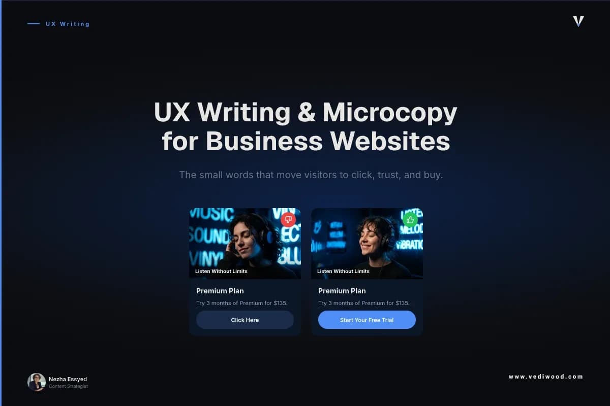
1. The primary call-to-action button. “Submit” and “Learn more” tell the visitor nothing. The button is where intent turns into action, so it should name the action and the value — “Get my free quote”, not “Submit”.
2. The contact or enquiry form. Every field is a small ask. Labels, placeholder text, and a one-line reason for sensitive fields like a phone number decide whether someone finishes or bails.
3. The services or pricing page CTA. This is where a warm visitor decides to reach out. The microcopy here should remove the last doubt — “No obligation, reply within one working day” does more than another paragraph of features.
4. Error and validation messages. A blunt “Invalid input” at the finish line is where leads die. A message that says what went wrong and how to fix it keeps the visitor moving.
5. Confirmation and empty states. The line after someone submits — “Thanks, we’ll be in touch within 24 hours” — sets expectations and builds trust. Silence or a generic “Success” wastes the one moment you have earned their full attention.
These five moments are where a business website actually converts. They are also, on most sites, the least edited words of the lot.
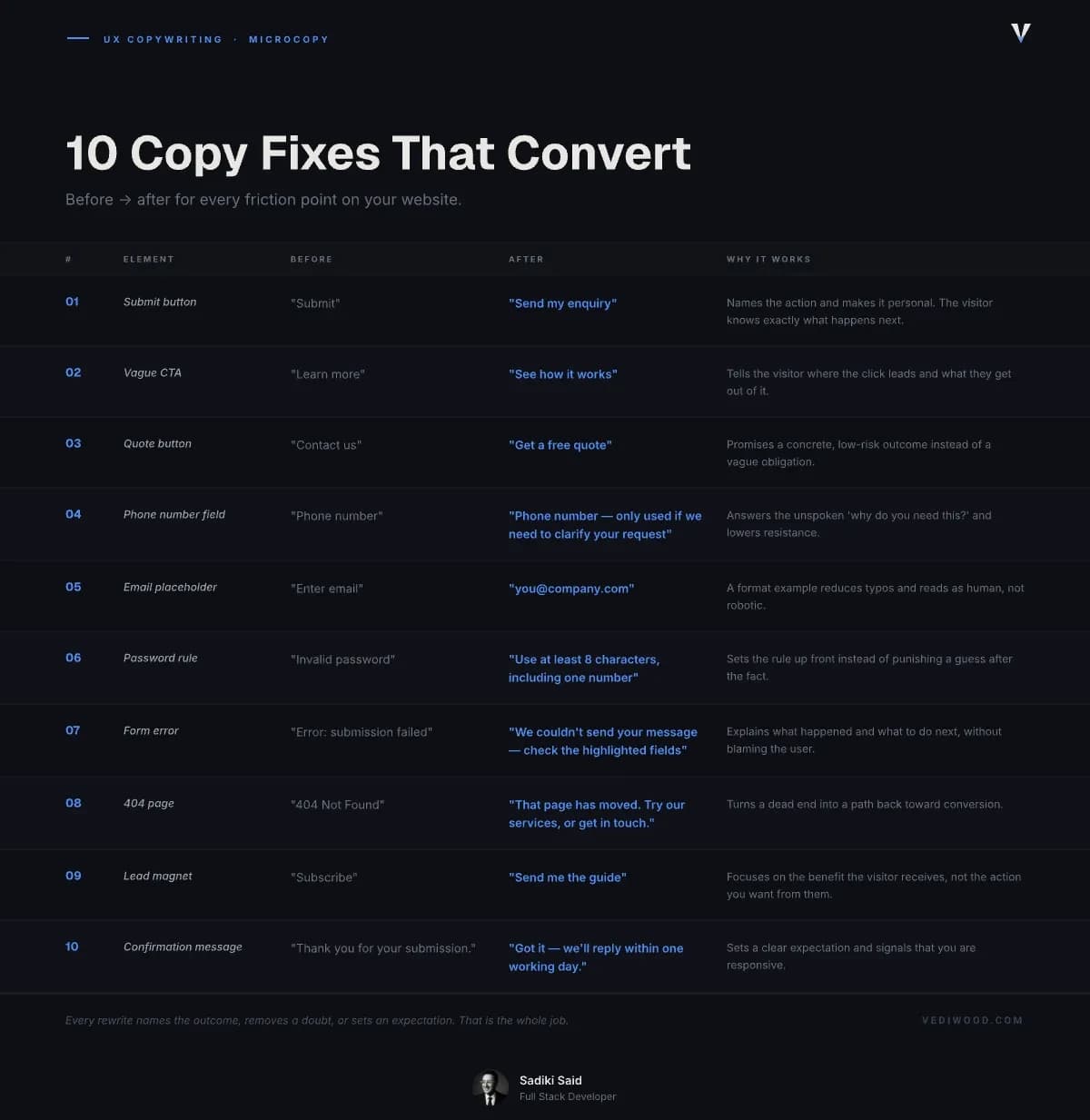
10 Microcopy Rewrites You Can Copy Today
Here are ten before-and-after rewrites pulled from the moments above. Use them as patterns, not scripts — adapt the wording to your own brand voice.
1. The generic submit button
Before: “Submit” — After: “Send my enquiry” — Why: Names the action and makes it personal. The visitor knows exactly what happens next.
2. The vague CTA
Before: “Learn more” — After: “See how it works” or “Get a price” — Why: Tells the visitor where the click leads and what they get out of it.
3. The quote button
Before: “Contact us” — After: “Get a free quote” — Why: Promises a concrete, low-risk outcome instead of a vague obligation.
4. The phone number field
Before: “Phone number” — After: “Phone number — only used if we need to clarify your request” — Why: Answers the unspoken “why do you need this?” and lowers resistance.
5. The email placeholder
Before: “Enter email” — After: “you@company.com” — Why: A format example reduces typos and reads as human, not robotic.
6. The password or format rule
Before: “Invalid password” — After: “Use at least 8 characters, including one number” — Why: Sets the rule up front instead of punishing a guess after the fact.
7. The form error
Before: “Error: submission failed” — After: “We couldn’t send your message — please check the highlighted fields and try again” — Why: Explains what happened and what to do next, without blaming the user.
8. The 404 page
Before: “404 Not Found” — After: “That page has moved. Try our services, or get in touch.” — Why: Turns a dead end into a path back toward conversion.
9. The lead magnet or newsletter
Before: “Subscribe” — After: “Send me the guide” — Why: Focuses on the benefit the visitor receives, not the action you want from them.
10. The confirmation message
Before: “Thank you for your submission.” — After: “Got it — we’ll reply within one working day.” — Why: Sets a clear expectation and signals that you are responsive.
Notice the pattern: every rewrite names the outcome, removes a doubt, or sets an expectation. That is the whole job.
How to Write Microcopy That Converts: 6 Rules
Once you have seen the rewrites, the rules behind them are easy to apply to any page.
- Name the outcome, not the action. “Get my quote” beats “Submit” because it tells the visitor what they actually get.
- Write the way your customers speak. Read it aloud — if you would not say it to someone across a desk, rewrite it.
- Answer the unspoken question. Beside any sensitive field or risky action, add one short line that removes the doubt.
- Never blame the user. Errors should explain and guide, not accuse. “That email doesn’t look right” beats “Invalid email”.
- Be specific over clever. “Reply within one working day” builds more trust than a witty line nobody believes.
- Stay consistent. If your buttons are warm and your errors are cold, visitors feel the seam. Pick one voice and hold it everywhere.
Clarity wins every time it competes with cleverness — when in doubt, cut the joke and keep the meaning.
Using AI to Draft and Improve Your Microcopy in 2026
You do not need to hire a UX writer to get this done. In 2026, the fastest way to draft and pressure-test microcopy is to use an AI assistant like Claude and a checker like Grammarly to tighten it.
The trick is the prompt. Give the tool the context — the page, the action, your brand voice, and the doubt you are trying to remove — then ask for five short options. For example: “Write five button labels for a plumber’s quote form. Friendly, plain English, under four words, focused on the outcome.”
Then edit hard. AI is good at generating options and bad at knowing your customer, so treat every suggestion as a draft. Use AI to get from blank page to rough draft fast — then apply the six rules above to choose the one that actually fits.
One warning: AI tends toward generic, upbeat phrasing. If a label sounds like every other website, it is doing the opposite of what good microcopy should do. The words that convert are the ones that sound specifically like you.
Get the Words on Your Site Working
If reading this made you look at your own contact form and wince, that is the right instinct. The words at your conversion points are almost certainly costing you enquiries you already paid to attract.
Start with the five moments above — your main button, your form, your services CTA, your error messages, and your confirmations. Rewrite them this week using the ten patterns.
If you would rather have it done properly, as part of a site built to convert from the ground up, book a free 30-minute call with Vediwood. No pitch — just an honest look at where your words are losing you work.
Follow Us
Most founders read us once and change something that week.
Every issue covers one thing that makes your website work harder — better conversion, stronger SEO, or smarter design. No fluff, no agency speak. Just the decision you need to make this week.
Our Team

Sadiki Said
Full Stack Developer

Nezha Essyed
Content Strategist