Psychology of Website Conversions: What Makes Visitors Act
Good-looking websites fail to convert every day — not because of design, but because they ignore how visitors actually think. The practical guide to the psychological principles behind every high-converting website.

Your website gets traffic. Visitors land, scroll, and leave — and you cannot figure out what is wrong with your design. The problem is not design. It is the psychology behind how visitors think, decide, and act on your site.
The psychology of website conversions — the cognitive biases, emotional triggers, and decision-making patterns that shape every click — explains why some websites turn strangers into customers while equally polished sites get ignored. These are not abstract theories. They are the specific principles that separate a website that looks good from one that generates business.
This is not a guide for UX professionals. These are specific, testable changes that any business owner can apply to a website that already exists.
Why the Psychology of Website Conversions Matters More Than Design
A polished homepage does not guarantee conversions. Visitors do not leave because your site is ugly — they leave because it makes their brain work too hard.
Every visitor arrives with a problem they want solved, and they need confirmation in seconds. If your homepage opens with "Welcome to [Company Name]" instead of a clear statement of what you do and who you help, the visitor's brain has already started looking for the exit.
The real barrier is cognitive friction. When a visitor has to figure out what you offer, how to navigate to the right page, or where to click next, the brain defaults to its easiest option: leaving. A 2024 study by the Nielsen Norman Group found that UX designs built around psychological triggers improve conversion rates by an average of 34% — not through manipulation, but by reducing the mental effort required to take action.
This is where most business owners get stuck. They invest in visual design — colours, fonts, imagery — and assume conversions will follow. But a beautiful website with unclear messaging, competing calls to action, and no trust signals is packaging without substance. The packaging is not the problem. The experience is.
Understanding how visitors think is the difference between a website that collects dust and one that generates revenue.
The Three Decisions Every Visitor Makes in Five Seconds
Before a visitor reads a single paragraph of body copy, their brain has already made three unconscious assessments. Fail any one of them, and the visitor leaves — regardless of how good your offer is.
Am I in the Right Place?
This assessment happens in under one second. The brain scans the headline, the hero image, and the overall layout to confirm relevance. If someone searched for "web design pricing" and lands on a page that opens with your company history, the mismatch triggers an instant exit.
Match every page to the exact intent behind the visit. If someone clicked a search result about website cost, lead with pricing. If they came from a blog post about UX, lead with your UX expertise. Every landing page should answer the visitor's question within the first visible screen — no scrolling required.
Can I Trust This?
Trust is not a conscious decision. It is a feeling that forms before the visitor has finished reading a single sentence. Clean design, readable typography, visible contact information, and recognisable trust signals all communicate safety to the brain.
Research consistently shows that visitors judge a website's credibility within milliseconds — based on visual design, not content. A cluttered layout, low-resolution images, or a missing phone number can trigger doubt even if the business behind the site is excellent.
Specific trust signals outperform generic ones every time. "Trusted by hundreds of clients" is easy to ignore. A named testimonial with a real photo, a visible client logo, or a concrete number like "214 projects delivered" gives the brain something concrete to hold onto.
What Should I Do Next?
If the path forward is not obvious, the visitor will not create one. Every page needs one clear next step — one button, one form, one link that tells the visitor exactly what to do.
When a page offers five competing actions with equal visual weight, the visitor freezes. This is Hick's Law at work: the more choices you present, the longer it takes to decide — and on a website, delay almost always means exit. The most effective pages guide the eye from headline to supporting content to a single call to action, in that order.
Six Psychological Principles That Turn Visitors Into Customers
These are the specific mechanisms behind high-converting websites. Each one is grounded in behavioural science, and each one applies to any business website — not just e-commerce.
1. Social Proof
People follow what others have done. When a visitor sees that 200 businesses have used your service, or reads a testimonial from someone in their industry, the perceived risk drops immediately. Psychologist Robert Cialdini calls this "consensus" — we look to others' behaviour to determine our own.
The most effective social proof is specific and verifiable. "Great service!" means nothing. "They redesigned our checkout flow and our conversion rate went from 1.8% to 4.2% in six weeks" means everything. Named clients, real numbers, and recognisable logos outperform generic praise every time.
Place social proof at decision points — next to your pricing, beside your contact form, below your primary CTA. That is where doubt lives, and that is where proof needs to answer it.
A balanced mix of positive and critical reviews also builds more trust than exclusively five-star ratings. Consumers become skeptical when every review is perfect. Include reviews that mention minor drawbacks alongside strong recommendations — it signals that the feedback is real.
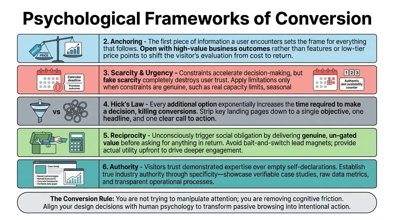
2. Anchoring
The first piece of information a visitor encounters sets the frame for everything that follows. Show a premium price first, and the standard price feels reasonable by comparison. Lead with your biggest result, and every subsequent result feels credible.
Anchoring determines how visitors evaluate your value — and you control the anchor. If your services page opens with a feature list, visitors anchor on features and start comparing you to cheaper alternatives. If it opens with a business outcome — "Our clients see an average 40% increase in qualified leads within 90 days" — visitors anchor on results. That shifts the entire conversation from cost to return.
3. Scarcity and Urgency
When something feels limited, the brain assigns it more value. "Three project slots available this quarter" or "pricing increases July 1st" can accelerate decisions — but only when the constraint is genuine.
Fake scarcity destroys trust faster than real scarcity builds it. Artificial countdown timers on an always-available service, "only 2 left!" on a digital product with infinite supply, or fabricated waitlists do not create urgency. They create suspicion. Use scarcity only when the limitation is real: genuine capacity constraints, seasonal pricing, or time-limited offers with a clear reason behind the deadline.
4. Hick's Law
Named after psychologist William Edmund Hick, this principle states that every additional option increases the time required to make a decision. On a website, increased decision time means lower conversions.
The implication is direct: simpler pages convert better than complex ones. A landing page with one offer, one headline, and one call to action will outperform a page with three offers and five buttons — even if the complex page has objectively better content. Strip your key conversion pages to a single objective. Navigation should guide visitors forward, not overwhelm them with a menu of fifteen competing links.
5. Reciprocity
Give something genuinely valuable before asking for anything in return. A free site audit, a pricing calculator, or a detailed guide creates a psychological debt that makes the visitor more likely to engage.
Reciprocity works because the brain tracks social obligations unconsciously. When you deliver real value upfront — not a gated PDF that turns out to be a sales brochure, but genuinely useful information — the visitor feels a subtle pull to reciprocate. That might mean filling out a form, booking a call, or simply remembering your brand the next time they need help.
The key is actual value. A "free ebook" that is really a 30-page advertisement does not trigger reciprocity. It triggers regret.
6. Authority
Visitors trust demonstrated expertise over claimed expertise. An article that references specific data, names specific tools, and shows measurable results signals competence. A page that says "we are industry leaders" without evidence signals the opposite.
Authority is earned through specificity, not declarations. Publish case studies with real outcomes. Reference the frameworks and methodologies you use by name. Show your process, not just your promises. The more concrete your expertise appears, the less the visitor needs to take your word for it.
How Cognitive Bias Shapes Every Click on Your Website
Beyond the six principles above, several cognitive biases quietly shape how visitors interact with your pages — often without either party realising it.
Loss Aversion
People feel the pain of a loss roughly twice as strongly as the pleasure of an equivalent gain. This bias has a direct application in website copy: "Stop losing 30% of your leads to a slow checkout" is more compelling than "speed up your checkout to gain 30% more leads." Frame your value in terms of what the visitor stands to lose by not acting — lost revenue, wasted ad spend, missed opportunities.
The Zeigarnik Effect
People remember and feel compelled to complete unfinished tasks. A progress bar showing "Step 2 of 3" on a multi-step form creates a psychological pull to finish what was started. Multi-step forms consistently outperform single long forms — not because they collect less information, but because each completed step creates momentum toward the next.
If your forms have more than four fields, break them into stages. Show progress visually. Give the visitor a sense of completion at each step.
The Von Restorff Effect
When one element looks visually distinct from everything around it, it captures attention and sticks in memory. Your call-to-action button must contrast with the rest of the page. If everything is blue and your button is also blue, the brain registers it as background — not as an action point.
The same principle applies to key statistics, testimonial blocks, and pricing tables. Anything you want the visitor to notice needs to look different from its surroundings.
The Bandwagon Effect
When visitors see evidence that many people have already chosen your service, the brain interprets popularity as a signal of quality. Displaying the number of customers served, projects completed, or reviews collected creates momentum that makes each new visitor more likely to act. Quantity signals quality when the visitor has no other way to evaluate you — which is the default state for most first-time website visitors.
Cognitive Load
The brain has a limited processing budget for any given moment. Every unnecessary element on a page — a rotating banner, an auto-playing video, a wall of unbroken text — consumes part of that budget. When the budget runs out, the visitor leaves.
Reduce cognitive load by removing anything that does not directly serve the visitor's goal on that page. Break content into short paragraphs. Use clear headings. Eliminate decorative elements that add visual noise without adding clarity.
How to Spot the Psychological Gaps on Your Own Website
You do not need a psychology degree to audit your site. Run through these seven checks on every key page — homepage, services, pricing, and contact.
1. Can a stranger understand what you do in five seconds? Open your homepage on someone else's phone and ask them what the business does. If they cannot answer without scrolling, your headline is failing. The fix is almost always simpler language — not more language.
2. Is there one clear action per page? Count the number of buttons and links visible on the first screen. If more than two compete for attention, the visitor has to choose — and choosing creates friction. Pick the single action that matters most and make it visually dominant.
3. Are your trust signals specific? Replace every generic claim with a concrete number, name, or result. "Hundreds of happy clients" becomes "214 projects delivered since 2019." "Award-winning design" becomes the name of the award and the year it was given. Specificity is what makes trust signals believable.
4. Does your copy talk about the visitor or about yourself? Count the ratio of "we/our" to "you/your" on your homepage. If "we" appears more often, the copy is oriented around your business — not the visitor's problem. Rewrite each "we" sentence to lead with the visitor's situation.
5. How many steps does it take to convert? Map every click, scroll, and form field between landing on the page and completing the desired action. Every unnecessary step is a potential exit point. Remove anything that does not directly move the visitor toward the goal.
6. Do your images work harder than decoration? Every image on a key page should show a result, demonstrate your work, or reinforce trust. Stock photos of handshakes and generic smiling people do not build credibility — they signal that you have nothing real to show. Use screenshots, project photos, or real team portraits instead.
7. Is your mobile experience a conversion path or a shrunken desktop? Mobile visitors make faster decisions and have less patience for scrolling. If your mobile site requires pinching, horizontal scrolling, or tiny tap targets, you are losing conversions that analytics will attribute to "mobile bounce rate" rather than what it actually is: bad mobile UX.
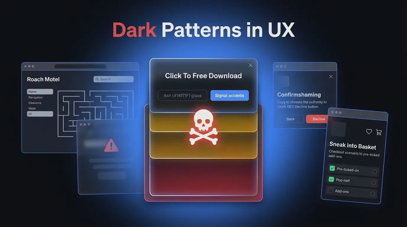
The Line Between Persuasion and Manipulation
Using psychology on your website is not the same as deploying dark patterns. Persuasion helps a visitor make a decision they already want to make. Manipulation tricks them into a decision they would not make with full information.
Dark patterns — hidden fees revealed at checkout, confusing unsubscribe flows, fake urgency timers, misdirected clicks — may produce short-term conversions. They also produce refund requests, negative reviews, and permanent trust damage.
Ethical persuasion reduces friction, builds genuine trust, and makes it easy for visitors to act on intentions they already have. If your visitor would feel good about their decision a week later, your approach is ethical. If they would feel tricked, it is not.
The business case is straightforward. Customers who feel respected come back, refer others, and leave positive reviews. Customers who feel manipulated do the opposite — and they do it publicly.
What to Do If Your Website Gets Traffic but Not Conversions
If people are finding your site but not taking action, the gap is almost always psychological — not visual.
Start with the seven-question audit above. Fix the biggest gap first. Most websites improve measurably by simplifying navigation, rewriting the homepage headline to focus on the visitor's problem, and placing specific social proof next to key calls to action.
These are not cosmetic changes. They are structural decisions that align your website with how visitors actually think and decide.
If you want a website built around these principles from the ground up — where psychology informs every design decision, not just the copy — that conversation starts with a look at what Vediwood builds and how. No pitch, no pressure. Just an honest assessment of what is holding your site back and what it would take to fix it.
Follow Us
Most founders read us once and change something that week.
Every issue covers one thing that makes your website work harder — better conversion, stronger SEO, or smarter design. No fluff, no agency speak. Just the decision you need to make this week.
Our Team

Sadiki Said
Full Stack Developer

Nezha Essyed
Content Strategist