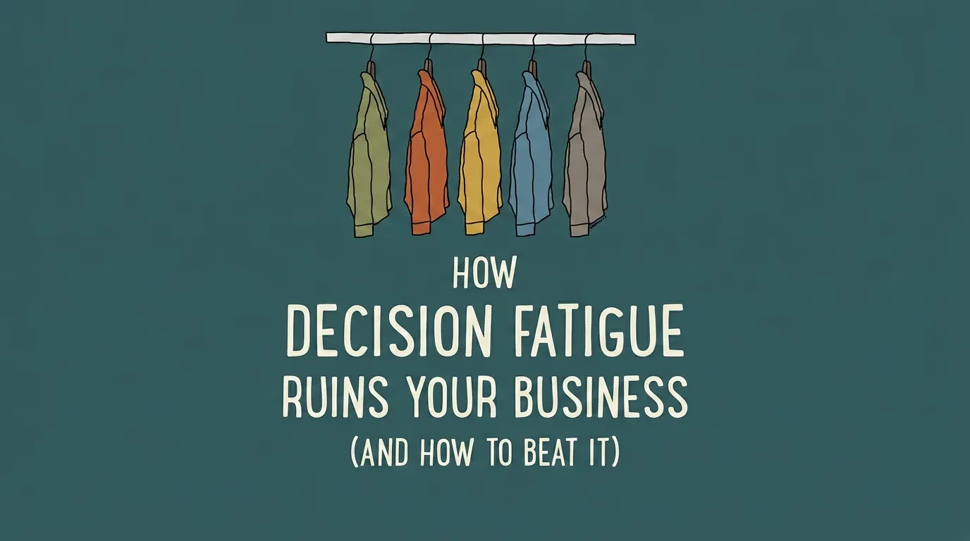
UX Audit for Business Website: Find What's Losing Sales
Your website gets visitors but they leave without buying, and a redesign is an expensive guess at why. This is the do-it-yourself UX audit that finds the real friction first, with free tools and one honest rule for when to call in help.


Your website gets visitors. They land, they look, and most of them leave without buying or booking. A UX audit for your business website is the fastest way to find out why — and you can run the first one yourself, this week, without paying for a redesign. It is a structured walk through your own site, hunting for the exact points where people get confused, stuck, or bored enough to give up. Do it right and you stop guessing about what to fix.
What a UX Audit Is — and Why It Beats a Redesign
A UX audit is a systematic review of how real people move through your site. You are not judging whether it looks nice. You are finding friction — the small frustrations that add up to a closed tab and a lost sale.
Most redesigns start with an opinion. Someone decides the site "feels dated," so the whole thing gets rebuilt, and the same conversion problems quietly survive the move. An audit flips that order. Find the problem first, then fix only what is actually broken.
That is why the audit pays for itself. A redesign can cost five figures and still miss the one form field that was scaring people off. The audit tells you where the money is leaking before you spend a cent changing anything.
It also gives you a shared language with whoever does the work. Instead of "make it look fresher," you hand over a list of specific problems tied to specific pages. That alone saves weeks of back-and-forth.
When Your Business Website Actually Needs a UX Audit
You do not need an audit because a blog told you to. You need one when your numbers are telling you something is wrong. The signals are usually loud once you know what to listen for.
- You get steady traffic but very few sales, leads, or bookings.
- People add to cart and never check out.
- Your bounce rate is high and your average session lasts seconds, not minutes.
- You are about to spend real money on a redesign or an ad campaign.
- Customers keep emailing questions the site should already answer.
Each of these is a symptom, not a cause. "Traffic but no sales" is the one we hear most from founders, and it is almost always a UX problem wearing a marketing complaint's clothing. You are paying to bring people to a door that is harder to open than you think.
The audit's job is to turn that vague "it's just not converting" into a specific list you can act on. Vague problems get ignored. Specific problems get fixed.
What to Set Up Before You Start (It Takes an Afternoon)
A useful audit needs a benchmark. Without one, you are just browsing your own site and calling it research. Three things get you ready, and none of them cost money.
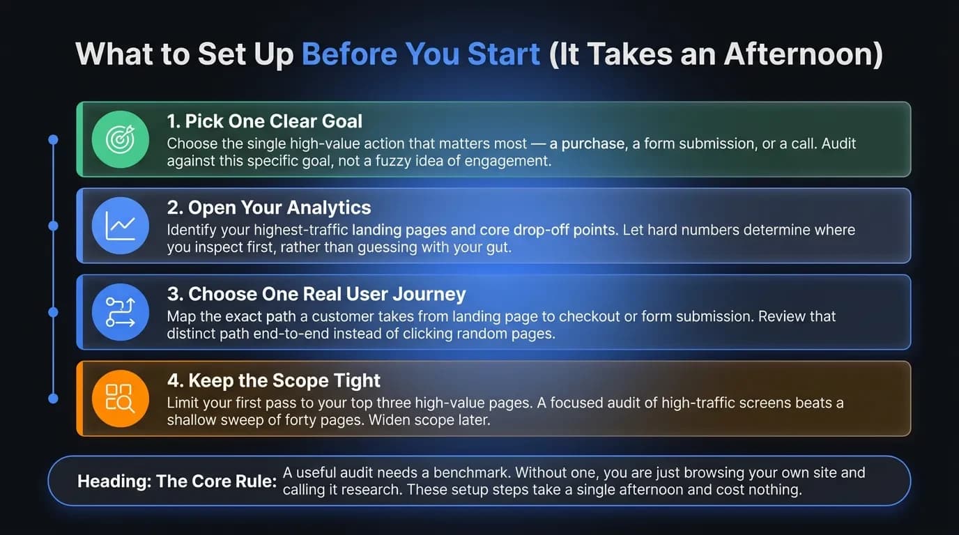
Pick one clear goal. Choose the single action that matters most to the business — a purchase, a form submit, a phone call. You audit against that one goal, not against a fuzzy idea of "engagement." Everything you find gets judged by whether it helps or hurts that action.
Open your analytics. Find your top landing pages and the points where people drop off. Google Analytics is free, and if you have nothing installed yet, set it up today and give it a week to collect data before you start. The numbers decide where you look first, not your gut.
Choose one real user journey. Map the path a customer actually takes — homepage to product to checkout, or landing page to enquiry form. Audit that path end to end rather than poking at random pages.
Keep the scope tight on your first pass. A focused audit of your three highest-traffic pages beats a shallow sweep of forty. You can always widen it once the obvious wins are done.
How to Run a UX Audit on Your Website, Step by Step
Here is the process we use on real client sites, stripped down to what a non-designer can actually do alone. Work through it in order — each step feeds the next, moving from data to behaviour to judgement.
Step 1: Pull your numbers and find the biggest drop-off
Start in your analytics, not on the page. Build a simple funnel for your key journey — landing page, product or service page, cart or form, then confirmation. Note the single biggest percentage drop between two steps.
That drop is where your audit begins. A page where 80% of people leave is worth more of your attention than ten pages where 5% do. Let the data point at the wound before your opinion gets involved.
Segment by device while you are there. If desktop converts fine and mobile falls off a cliff, you have just saved yourself hours of looking in the wrong place.
Step 2: Watch real people use your site
Numbers tell you where people leave. Recordings tell you why. Install a free heatmap-and-recording tool — Microsoft Clarity is genuinely free with no traffic cap, and Hotjar has a free tier — and watch ten real sessions on your problem page.
Look for rage clicks, frantic scrolling, and people hovering over text that isn't actually a link. Watch where the cursor hesitates and circles. Those hesitations are confusion you can design away.
Ten sessions sounds small, but patterns show up fast. When three people in a row miss the same button, you have found a fix, not a coincidence.
Step 3: Walk the page against the 10 usability heuristics
Now go through the page yourself, using a checklist professionals have trusted for thirty years. Jakob Nielsen's 10 usability heuristics, published by the Nielsen Norman Group in 1994 and still the industry standard, are ten plain questions about whether an interface respects the person using it.
Ask the simple versions. Does the page tell users what is happening after they click? Does it use words a customer would use instead of internal jargon? Can someone undo a mistake without starting over?
Every honest "no" is a fix waiting to happen. You do not need design training to spot them — you need to slow down and actually read your own screen like a first-time visitor would.
Step 4: Check it on a phone, then check the speed
Most of your traffic is on a phone, so audit the phone first. Open the journey on your own mobile and try to complete the goal one-handed. Tiny tap targets, text you have to pinch, and a buy button hidden below the fold are silent conversion killers.
Then test speed. A slow page raises bounce before anyone even sees your offer, and Google treats page experience as part of how it ranks you. Run your URL through a free speed tool and fix the heaviest images first — that is usually the cheapest, fastest win on the whole list.
Step 5: Check the basics of accessibility
Accessibility is not a legal box to tick. It is usability for everyone, including the customers most likely to leave quietly without telling you why. Check colour contrast, make sure every form field has a visible label, and try to move through the whole page using only your keyboard.
The Web Content Accessibility Guidelines (WCAG) from the W3C are the global standard, and most fixes are small. If a keyboard cannot get through your checkout, a real share of your market cannot either — and they will spend their money somewhere that lets them.
A UX Audit Checklist You Can Copy
Use this as your scorecard. Go page by page through your key journey and mark each item pass, fail, or fix-later. Be harsh — the point is to find problems, not to feel good.
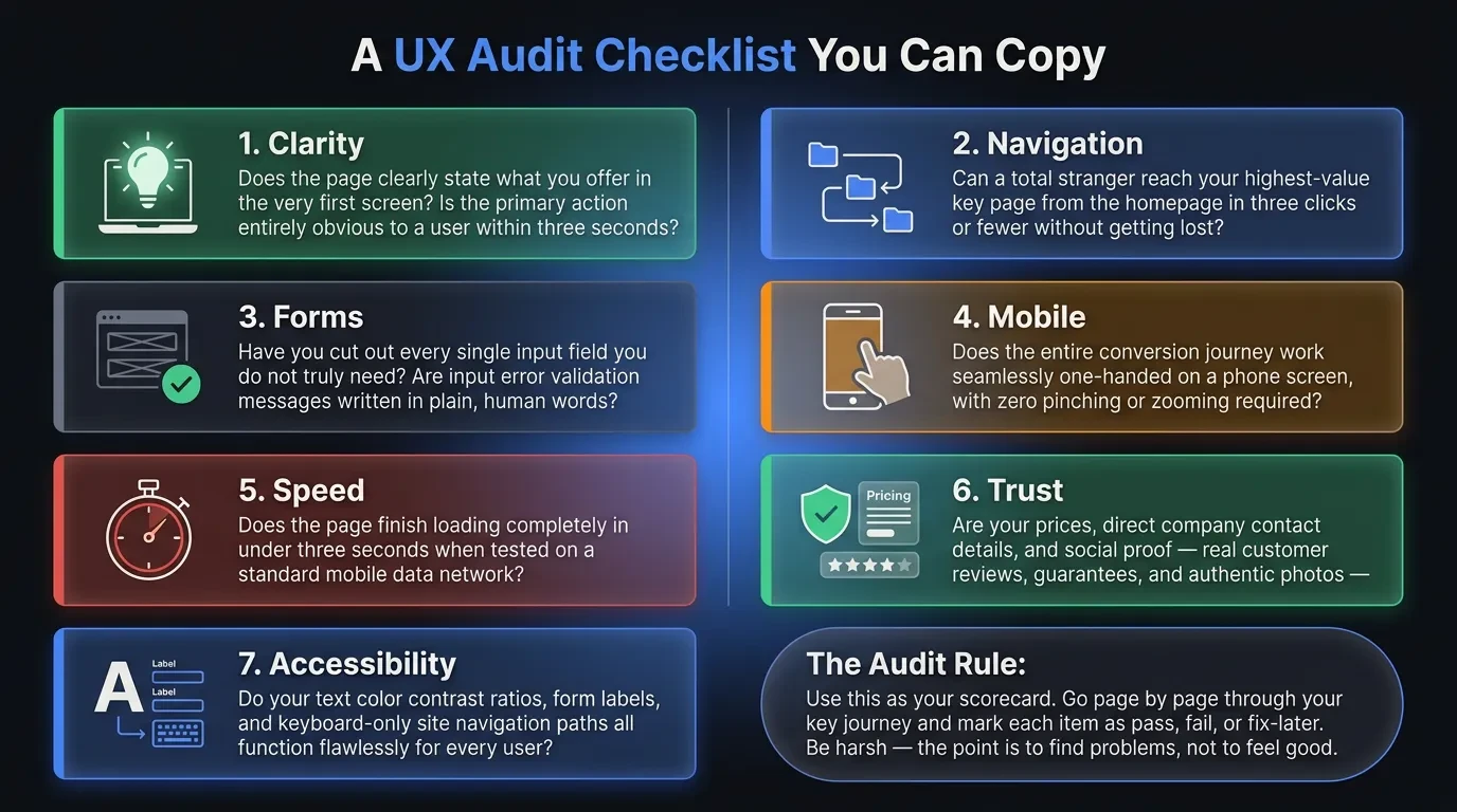
- Clarity: Does the page say what you offer in the first screen? Is the main action obvious within three seconds?
- Navigation: Can a stranger reach your key page in three clicks or fewer?
- Forms: Have you cut every field you do not truly need? Are error messages written in plain words?
- Mobile: Does the entire journey work one-handed on a phone, with no pinching?
- Speed: Does the page load in under three seconds on mobile data?
- Trust: Are prices, contact details, and proof — reviews, guarantees, real photos — easy to find?
- Accessibility: Do contrast, form labels, and keyboard navigation all work?
This is a starting checklist, not the whole science of UX. But run it honestly across your top pages and you will surface more than enough to keep your next development sprint busy — and almost all of it will matter more than another colour change.
How to Turn a List of Problems Into Fixes That Matter
A first audit usually produces twenty or thirty issues. The mistake is trying to fix them all at once and stalling under the weight of the list.
Score each issue on two things: how much it hurts the user, and how hard it is to fix. Plot them quickly in a spreadsheet, then start with the high-impact, low-effort corner. A confusing checkout button beats a misaligned footer every time, even though the footer is easier to notice.
Write each finding as a sentence someone can act on. "Checkout button sits below the fold on mobile — move it above the fold" is useful. "Improve the checkout" is not a task, it is a wish.
Then ship in small batches and watch the same analytics you started with. An audit is only worth something once the numbers move — so close the loop and let the data tell you whether the fix worked.
When to Run the Audit Yourself — and When to Hire a Studio
A DIY audit is the right first move for almost every small business. It is free, it is fast, and it forces you to look at your own site like a stranger instead of like its proud owner.
Do it yourself when the goal is clear, the site is small to mid-sized, and you mainly need to find the obvious friction. You will catch the costly, embarrassing problems hiding in plain sight without spending a thing. Most founders are genuinely surprised by what one focused afternoon turns up.
Bring in help when the stakes climb. A full audit with moderated usability testing, several user segments, and a redesign plan is a different job — one that takes a trained eye and the better part of 40 to 80 hours. If your revenue leans on the site and the easy wins are already shipped, that is the line.
We build and audit sites for e-commerce and media businesses, so we are biased — but here is the honest version anyway. If a free afternoon would have caught your problem, do that afternoon first. Pay for the deep work only once the cheap work has run out.
Can AI Run Your UX Audit in 2026?
This is the question every founder asks now, and the honest answer is: partly. AI has taken over the tedious half of the job, and that is genuinely useful.
AI-powered tools have changed how fast you can see patterns. Hotjar's AI features and platforms like FullStory now surface friction and summarise session data that used to take hours to comb through by hand. You can even hand a model like Claude your URL and ask it to flag obvious usability problems before you start.
What AI does well is speed and pattern-spotting across large piles of data. What it still cannot do is understand your specific customer, your business goal, or why one particular hesitation is costing you money. It tells you what is unusual; it does not tell you what is expensive.
Use AI to gather and sort, not to decide. Let it crunch the recordings and the heatmaps, then bring human judgement to the part that actually changes your design and your revenue. The tool finds the noise — you still have to name the signal.
Find the Friction First, Then Fix It Right
A UX audit turns "my site isn't working" into a list you can actually do something about. Run the DIY version this week — your analytics, ten session recordings, the ten heuristics, and the checklist above — and you will understand your own site better than most redesigns ever manage to.
If the audit shows the problem runs deeper than an afternoon can reach, or you would rather have it done properly the first time, that is the work we do. See how Vediwood approaches a web project, and we will give you a straight answer on what is actually worth fixing.
Follow Us
Most founders read us once and change something that week.
Every issue covers one thing that makes your website work harder — better conversion, stronger SEO, or smarter design. No fluff, no agency speak. Just the decision you need to make this week.
Our Team

Sadiki Said
Full Stack Developer

Nezha Essyed
Content Strategist