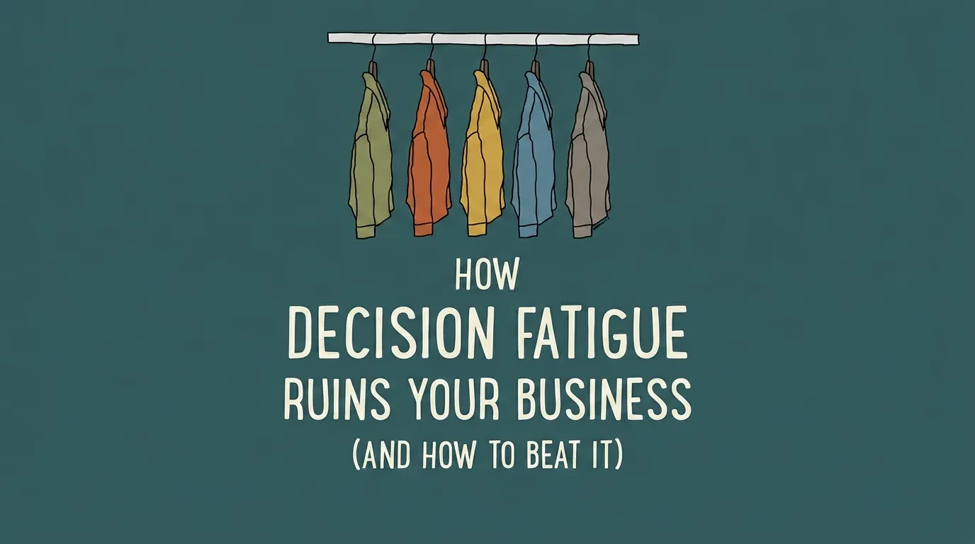
Emotional Design for Business Websites: What Works
Most business websites look professional but fail to connect. This is the practical guide to emotional design — the specific decisions that make visitors feel something, stay longer, and choose you.

Your website loads fast, the layout is clean, and the colours match your brand. Yet visitors leave without clicking a single button. The problem is not how your site looks — it is how your site makes people feel.
Emotional design for business websites is the difference between a site that gets traffic and one that gets customers. That disconnect — between a site that functions and a site that connects — is what this article unpacks. You will learn what emotional design is, why it drives conversions, and which specific design decisions you can act on now.
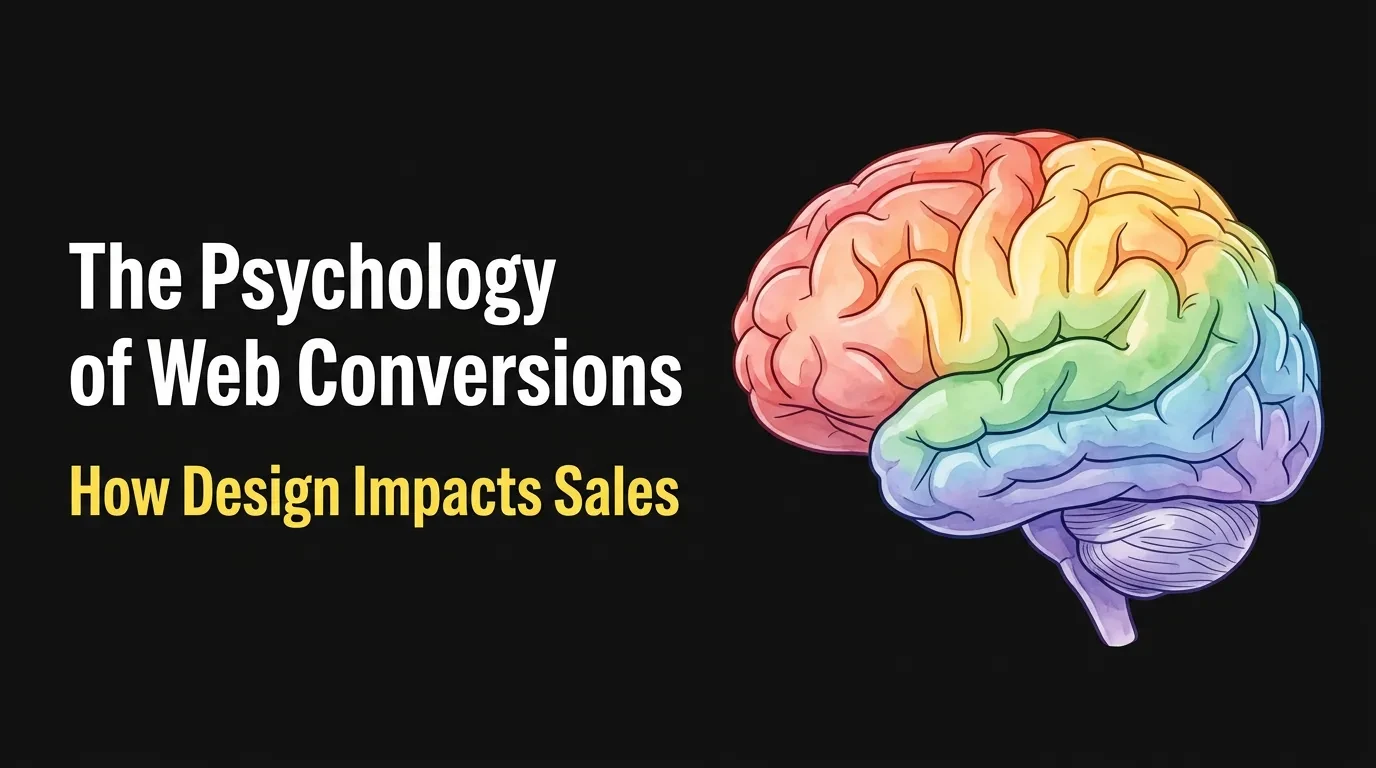
What Emotional Design Actually Means for Your Website
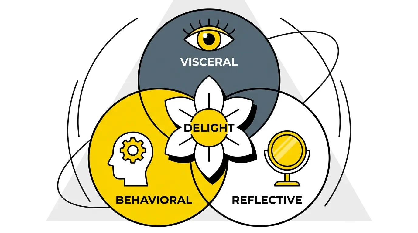
Emotional design is a framework coined by cognitive scientist Don Norman. It describes how people respond to designed objects — including websites — on three distinct levels.
Visceral is the gut reaction. It happens in the first half-second. Your visitor sees the colour palette, the imagery, the overall feel of the page — and their brain decides "I trust this" or "I'm leaving" before they read a single word.
Behavioural is the experience of using the site. Can I find what I need? Does the menu make sense? Is this form going to waste my time? These micro-judgements happen below conscious awareness, and they trigger frustration or satisfaction within seconds.
Reflective is the lasting impression. After someone leaves your site, this is what stays: "That brand felt professional." "That business understood my problem." "I'd go back there." Reflective responses drive word-of-mouth, return visits, and buying decisions weeks later.
Most business owners invest in the visceral level — making the site look good. Some invest in the behavioural level — making it work smoothly. Almost nobody deliberately designs for the reflective level — the emotional impression that actually drives revenue.
Why Your Website Looks Fine But Doesn't Convert
Researchers at Missouri S&T found that users form a first impression of a website in less than two-tenths of a second. That impression is not about content. It is entirely about how the page feels.
A website can be technically well-built — responsive, fast, SEO-friendly — and still feel empty. Generic stock photos, safe colour choices, and templated layouts tell the visitor "this is a business website," but they do not tell the visitor "this business understands me."
The result is a site that looks fine in a portfolio but performs poorly in reality. Visitors scroll without engaging. They read a headline but skip the call to action. They compare you to a competitor whose site felt more human — and choose them.
On Reddit, one business owner described the gap precisely: "The design speaks in layouts, buttons, and sections, but not in emotion or identity." That is the emotional void most business websites occupy. The issue is never that the design is bad. The issue is that the design is emotionally neutral — it does not make the visitor feel anything at all.
The Psychology That Makes Visitors Stay or Leave
Understanding why visitors leave means understanding how emotions drive behaviour online. Each of Don Norman's three response levels plays a specific role in a visitor's decision to stay, engage, or leave.
The visceral response is the gatekeeper. Within 50 milliseconds, a visitor's brain processes colour, contrast, layout complexity, and visual hierarchy. If those signals are misaligned with the visitor's expectations — a law firm with playful cartoon illustrations, or an organic food brand with a dark corporate palette — the response is "this is not for me," and they leave before reading a word.
The behavioural response is the test. Once a visitor decides to stay, they start trying to accomplish something: find a product, read a price, book a consultation. Every moment of friction — a confusing menu, a slow-loading page, a form that demands too much information — creates negative emotion. Frustration compounds faster than satisfaction. Three seconds of confusion can undo thirty seconds of strong visual design.
The reflective response is the verdict. This is the emotion visitors carry after they close the tab. Research from the Nielsen Norman Group confirms that users remember how an experience made them feel more accurately than what it contained. A visitor may forget your pricing but remember feeling confused. They may forget your product names but remember feeling understood.
Negative reflective responses are stickier than positive ones. A single frustrating interaction can override an otherwise strong visual impression. This is why designing for all three levels — not just the first — is what separates websites that convert from websites that merely exist.
5 Emotional Design Decisions That Change How People Feel
Emotional design is not abstract theory. It is built from specific, concrete decisions. Here are five that have the greatest impact on how visitors experience a business website.
1. Colour palette aligned to your brand's emotional intent. Colour is the single fastest emotional trigger on any web page. Warm tones — red, orange, amber — signal energy and urgency. Cool tones — blue, teal, green — signal trust and calm.
The key is not choosing "nice" colours but choosing colours that match the specific feeling your brand needs to create. A financial advisor's site should feel calm and reliable — blues, whites, subtle greys. A creative studio should feel bold and energetic — brighter, more saturated palettes. Match the palette to the emotion, not to personal preference.
2. Typography that carries emotional weight. Fonts are not just about readability. A rounded sans-serif font like Nunito or Quicksand feels friendly and approachable. A high-contrast serif font like Playfair Display feels authoritative and refined.
Most business websites default to whatever their template came with — missing the chance to reinforce emotional tone through every headline and paragraph. Typography is one of the cheapest changes with the highest emotional return.
3. Real photography instead of stock imagery. Stock photos are the fastest way to make a website feel generic. When every business in your sector uses the same handshake photo or the same diverse-team-at-a-whiteboard image, the visitor's brain filters it out as noise.
Real photos — of your space, your team, your actual work — create authenticity. Authenticity is the foundation of emotional trust. One imperfect but real photo outperforms ten polished stock images every time.
4. Whitespace as an emotional signal. Whitespace is not wasted space. It signals confidence, clarity, and quality. Luxury brands use generous whitespace because it makes the viewer slow down and pay attention.
Cluttered layouts create anxiety and overwhelm — two emotions that drive visitors away from conversion actions. If your page feels "busy," the visitor's subconscious reads it as chaos, not value.
5. Micro-interactions that create delight. A button that shifts colour on hover. A form that shows a brief confirmation animation. A scroll-triggered element that reveals content smoothly. These small interactions create tiny moments of satisfaction — what UX designers call "delight."
They make a website feel alive and responsive, reinforcing the behavioural level of emotional design. A site that responds to your actions feels like a conversation. A static site feels like a brochure.
How to Apply Emotional Design to Your Business Website
Emotional design is not a redesign project. It is a lens you apply to every decision — and you can start with what you already have.
Step 1: Define the one emotion your brand must evoke. Not three emotions. Not five. One. When a visitor leaves your site, what single feeling should they carry?
"This business is trustworthy." "This brand gets me." "These people understand my problem." Pick one. That emotional target becomes the filter for every design decision that follows.
Step 2: Audit your current site's emotional signals. Open your homepage in a new browser, as if you have never seen it before. What is the first feeling you get in the first two seconds?
Ask three people who are not designers to do the same and describe their gut reaction in one word. If they say "clean" or "fine" or "normal," your site is emotionally neutral. That is the problem you need to solve.
Step 3: Align visual tone and verbal tone. If your copy is warm, conversational, and human but your design is cold, corporate, and templated — they cancel each other out. The visual design and the written content must create the same emotional experience.
A mismatch between visual and verbal tone is worse than being average at both, because it creates subconscious distrust. The visitor senses something is off without being able to name it.
Step 4: Test with real users, not with your designer. Designers evaluate craft. Users evaluate feeling.
Show your site to people in your target audience and ask two questions: "What does this brand feel like?" and "Would you come back?" If their answers do not match your intended emotion from Step 1, the design is not working — regardless of how polished it looks.
The Emotional Touchpoints Most Business Websites Ignore
Some of the most powerful emotional moments on a website are the ones nobody thinks about.
Above the fold — the first emotional handshake
The first visible section of your homepage sets the emotional tone for everything that follows. Most business websites waste this space with a generic hero image and a vague tagline like "Your trusted partner in growth."
Instead, use the above-the-fold section to answer one question the visitor is already thinking. Show them you understand their problem before you offer your solution. That single shift transforms a passive hero section into an emotional hook.
The about page — story, not corporate timeline
Your about page is one of the most visited pages on any business site, and one of the most emotionally flat. Visitors go there to decide if they trust you.
A timeline of founding dates and office relocations tells them nothing. A story about why you started, what you believe, and who you do your best work for — that creates connection. The about page is not about you. It is about proving you understand the visitor.
Calls to action — personal, not robotic
"Submit" creates zero emotional response. "Get my free consultation" creates ownership and anticipation. The words on your buttons and links are micro-moments of emotional design.
"Let's talk" feels warm. "Enquire now" feels corporate. Small differences in CTA language directly affect whether visitors feel invited or processed.
Error states and microcopy — moments of unexpected personality
A 404 page that says "Page not found" is a dead end. A 404 page that says "We looked everywhere — this page doesn't exist, but we can help you find what you need" is a moment of empathy.
These tiny details reveal brand personality and build emotional goodwill precisely when a visitor is most likely to feel frustrated. Nobody budgets for 404 pages. The brands that design them well stand out because of it.
Common Mistakes That Kill Emotional Connection
Four patterns consistently destroy the emotional connection a business website could create.
Generic stock photography. The visitor's brain has seen the same stock images hundreds of times. When your site uses them, it triggers the same emotional response as every other website — which is no response at all. Invest in original photography or, at minimum, choose stock images that feel specific to your context rather than universally corporate.
Emotional overload. Adding too many visual triggers — bold colours, animated elements, large text, multiple competing CTAs — creates the opposite of engagement. It creates anxiety. The most emotionally effective websites feel calm and intentional, not loud and busy. Restraint signals confidence.
Inconsistent brand voice. If your homepage sounds warm and personal but your services page reads like legal copy, you have broken the emotional contract with the visitor. Every page is a chapter in the same story. When the tone shifts without reason, the visitor's subconscious registers it as untrustworthiness.
Ignoring the mobile emotional experience. Over 60% of web traffic comes from mobile devices, yet most emotional design decisions are made on desktop screens. Whitespace collapses, images crop differently, typography scales poorly.
If your site feels premium on desktop and cramped on mobile, you have lost the majority of your audience at the emotional level before they ever reach your content.
How to Know If Your Emotional Design Is Working
Emotional design is not guesswork. You can measure it with the tools you likely already have.
Bounce rate tells you whether the visceral response is working. A high bounce rate on key landing pages means visitors are arriving, feeling nothing — or something negative — and leaving. If your bounce rate drops after emotional design changes, the first impression is doing its job.
Time on site and pages per session reveal emotional engagement. When visitors feel connected, they explore. They click through to your about page, your case studies, your services. Short sessions and single-page visits signal that nothing on your site is emotionally pulling them deeper.
Heatmaps show where attention goes — and where it does not. Tools like Hotjar and Microsoft Clarity record what visitors actually look at and interact with. If your key emotional touchpoints — hero section, about page, CTAs — show low engagement in heatmaps, the emotional design in those areas is not landing.
Qualitative feedback is the strongest signal of all. When a new client says "your site just felt right" or "I could tell you were the one from your website" — that is emotional design converting. Ask new clients what made them choose you. If the answer references a feeling rather than a feature, your design is working exactly as intended.
What This Means for Your Next Website Decision
Your website is more than a digital storefront. It is the first emotional experience someone has with your brand — and for many visitors, it is the only one before they decide to trust you or move on.
The business owners who treat their website as an emotional tool — not just a functional one — consistently outperform those who do not. Not because their design is flashier, but because their design is more intentional.
If you are planning a new site or rethinking your current one, start with the question emotional design demands: what should a visitor feel when they land on your page? Every colour, every word, every interaction should answer that question deliberately.
If you want a website designed around emotional intent — not just aesthetics — explore how Vediwood approaches web projects. No templates, no guesswork. Design decisions grounded in how people actually think and feel.
Follow Us
Most founders read us once and change something that week.
Every issue covers one thing that makes your website work harder — better conversion, stronger SEO, or smarter design. No fluff, no agency speak. Just the decision you need to make this week.
Our Team

Sadiki Said
Full Stack Developer

Nezha Essyed
Content Strategist