Mobile UX Best Practices for Business Websites: The 2026 Guide
Over 62% of your website visitors are on a phone — but mobile converts at nearly half the desktop rate. Here’s how to audit your mobile UX in 20 minutes and fix the five problems draining your conversions.

Over 62% of all global web traffic arrives on a phone. Most of those visitors leave without doing a thing. That gap — between mobile traffic and mobile revenue — is not a marketing problem. It is a mobile UX problem, and most small business websites have five of them. This guide covers exactly what those problems are, why they happen, and how to audit your own site in 20 minutes without any technical background.
Why Your Mobile Traffic Isn’t Turning Into Revenue
Most business websites were designed on a desktop. A designer built a layout on a 1440-pixel screen, added a “mobile-responsive” setting so the site technically shrinks to fit a phone, and called it done. Nothing was actually designed for how people hold a phone, type with a thumb, or browse on a mobile connection outside a city.
Mobile users behave completely differently from desktop users. They scroll one-handed, tolerate zero friction, and are often in motion — on a commute, between meetings, outside in sunlight. A site that converts well on a laptop can be actively unusable on a phone, and the business owner never notices because they always review their site on a laptop.
The result is measurable: mobile conversion rates average 2.9% industry-wide, against 4.8% on desktop (industry benchmark, 2025). That gap is not inevitable. It is the direct cost of desktop-first thinking applied to a mobile-first audience.
The 5 Mobile UX Problems That Kill Business Conversions
These five problems appear on the majority of small business websites. Each one is fixable without a full rebuild, and each one has a measurable impact on revenue.
1. Your Site Takes Too Long to Load
53% of mobile visitors abandon a page that takes longer than 3 seconds to load — and each additional second reduces conversions by roughly 7% (Google Research, 2024). On a mobile network in a building, a basement, or a rural area, a site carrying uncompressed images can take 10 to 12 seconds to appear. The visitor is gone long before that happens.
The most common cause is image files that were never optimised for mobile. A hero image that looks identical at 4MB and at 200KB destroys mobile load time. Test your site right now at Google PageSpeed Insights — it is free, takes 30 seconds, and returns a specific list of what to fix ranked by impact.
2. Tap Targets Are Too Small to Press Accurately
Every button, link, and form field on your site is a tap target — something a finger needs to press accurately. Google recommends a minimum size of 48×48 density-independent pixels for all interactive elements, with at least 8 pixels of spacing between them. Most text link navigation and undersized “submit” buttons on small business sites fail this standard significantly.
When a visitor taps the wrong element, they do not try again. They leave. Small, closely packed tap targets create invisible friction that never appears in your analytics — but shows up directly in your mobile bounce rate and your zero-interaction session count.
3. Your Forms Create Too Much Work
Mobile checkout abandonment sits at 79%, compared to 68% on desktop (Baymard Institute, 2025). That extra 11 percentage points come almost entirely from form friction. Filling in eight or ten fields on a touchscreen keyboard — switching between text, number, and email input modes — is genuinely uncomfortable and slow. Research consistently shows that removing a single unnecessary field increases form conversion by 11%.
Audit every field in your contact forms and enquiry flows ruthlessly. Ask one question for each: is this absolutely essential for a first interaction? Date of birth, company size, secondary phone, preferred contact time — none of these are essential. A three-field form (name, email, message) will consistently outperform an eight-field form. Start there.
4. Key Actions Are Positioned Where the Thumb Cannot Reach
The top third of a smartphone screen requires a full hand stretch to reach. The bottom third is where the thumb naturally rests. Most websites place navigation menus and primary calls to action at the very top of the screen — which works fine on desktop but forces constant grip adjustments on mobile. Sixty-one percent of users aged 18 to 34 say the ability to use a website one-handed matters to them.
If your “Book a call,” “Buy now,” or “Get a quote” button sits at the top or the centre of the screen, your most important conversion action is at the hardest point to reach. Navigation links that are too close together compound this problem — a missed tap sends the user somewhere they did not intend to go, and most do not try to correct it.
5. Your Text Is Unreadable in Real Conditions
People check websites outside in sunlight, in coffee shops with overhead glare, and on phones with brightness turned low to preserve battery. Light grey text on a white background — a default in many modern templates — becomes invisible in those conditions. WCAG 2.1 requires a minimum contrast ratio of 4.5:1 for normal body text, and many popular site themes fail this threshold.
Low contrast is not only an accessibility concern — it is a direct conversion issue. A visitor who cannot read your headline or your value proposition in three seconds will not adjust their screen brightness to continue. They will assume the site does not work properly and leave. Check your current contrast ratios using a free tool before assuming your text is readable.
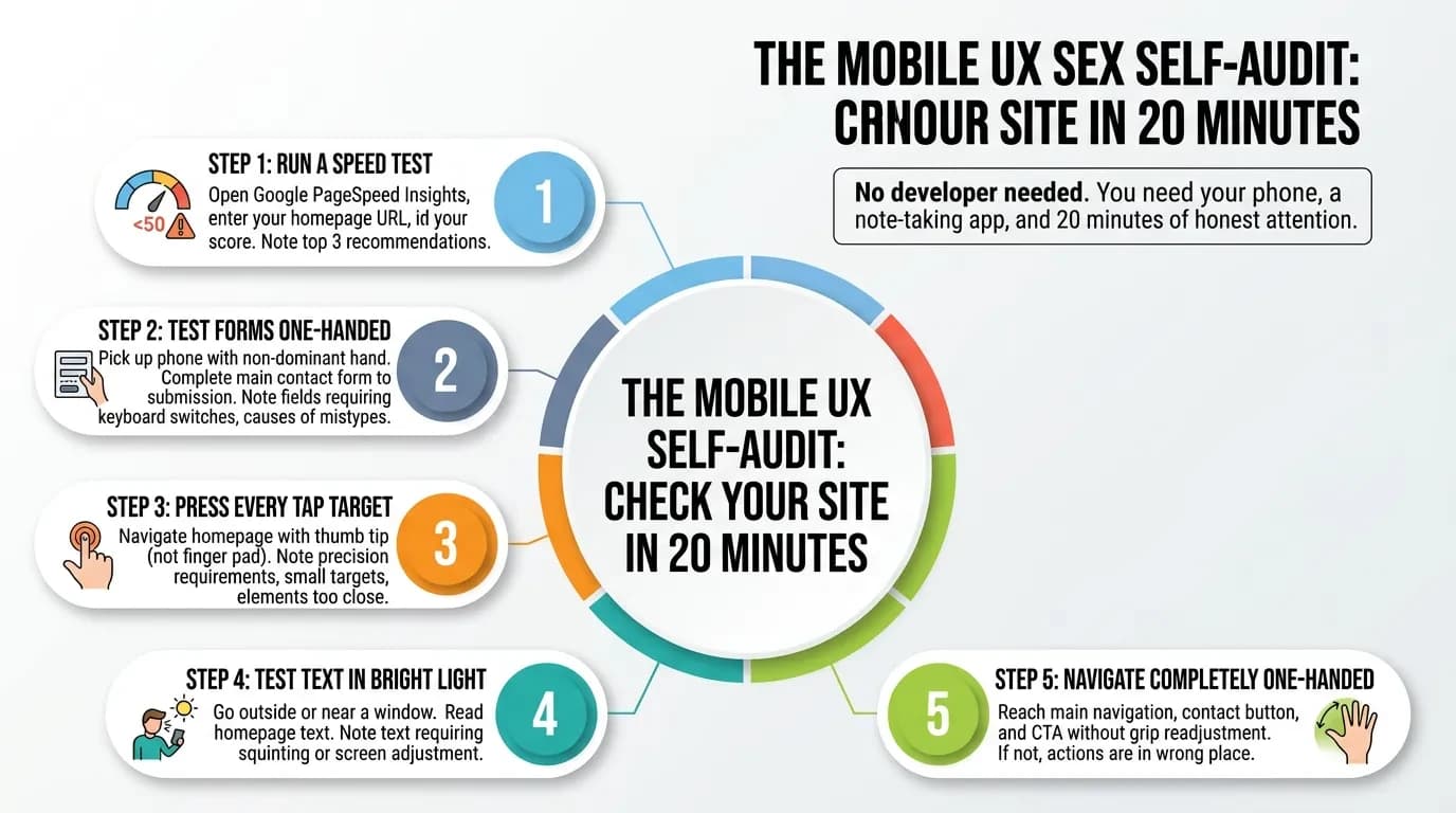
The Mobile UX Self-Audit: Check Your Site in 20 Minutes
You do not need a developer or a UX consultant to run this audit. You need your phone, a note-taking app, and 20 minutes of honest attention.
Step 1 — Run a speed test. Open Google PageSpeed Insights, enter your homepage URL, select Mobile, and read your score. Below 50 is a significant problem. Note the top three recommendations the tool flags — these are your highest-impact fixes.
Step 2 — Test your forms one-handed. Pick up your phone with your non-dominant hand and complete your main contact form from start to submission. Note every friction point: fields that require precision tapping, keyboard mode switches, anything that causes a mistype. If you give up mid-way, your visitors are giving up too.
Step 3 — Press every tap target. Navigate your homepage and press every button, link, and menu item with the tip of your thumb — not the pad of your finger. Note anything that requires precision, feels too small, or sits too close to another element.
Step 4 — Test your text in bright light. Take your phone to a window or step outside. Read every section of your homepage. Note any text that requires squinting, screen adjustment, or guessing at words.
Step 5 — Navigate completely one-handed. Try to reach your main navigation, your contact button, and your primary CTA without readjusting your grip. If you cannot, your most important actions are in the wrong place.
Every friction point you document is a place where a visitor left without becoming a customer. That is the cost.
These Are Targeted Fixes — Not a Full Rebuild
The most common reaction after completing this audit is: “This sounds like a complete redesign.” In most cases, it is not. Each of the five problems above has a targeted fix that leaves your brand identity, your content, and your site structure entirely untouched.
Image compression is a task measured in hours. Increasing touch target sizes and spacing takes an afternoon. Cutting a form from eight fields to three takes 30 minutes. Adjusting contrast values across a site template can be done in a single working day. Repositioning CTAs within thumb reach is faster still.
A 10% investment in UX improvement has been shown to drive conversion rate increases of up to 83%. The businesses that close the mobile conversion gap do not rebuild their entire website — they find the five specific things working against them, and they fix those. The audit shows you exactly where to look.
Ready to Stop Losing Mobile Visitors?
If your audit turned up two or more of the problems above, your mobile site is turning away paying customers every day — from the same traffic you are already paying to acquire. Vediwood builds and rebuilds business websites with mobile UX as the design brief, not an afterthought added at the end.
Book a conversation about your site — we will walk through your mobile experience together and show you exactly what it is costing you.
Follow Us
Most founders read us once and change something that week.
Every issue covers one thing that makes your website work harder — better conversion, stronger SEO, or smarter design. No fluff, no agency speak. Just the decision you need to make this week.
Our Team

Sadiki Said
Full Stack Developer

Nezha Essyed
Content Strategist