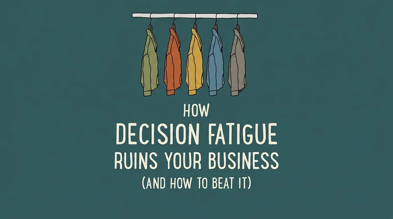
Cognitive Biases in Web Design for Business: 7 Fixes
Your website isn’t losing sales because it looks bad — it’s losing them because it ignores how visitors actually decide. Here are the 7 cognitive biases shaping every click, and the exact change to make for each one.

Your website isn’t underperforming because it looks bad. It’s underperforming because it was designed around your taste — not around the mental shortcuts your visitors use to make decisions in seconds. Those shortcuts are called cognitive biases, and in web design for business they quietly decide who buys and who bounces. This guide covers the seven biases that matter most on a business website, in plain English, with the exact change to make for each one.
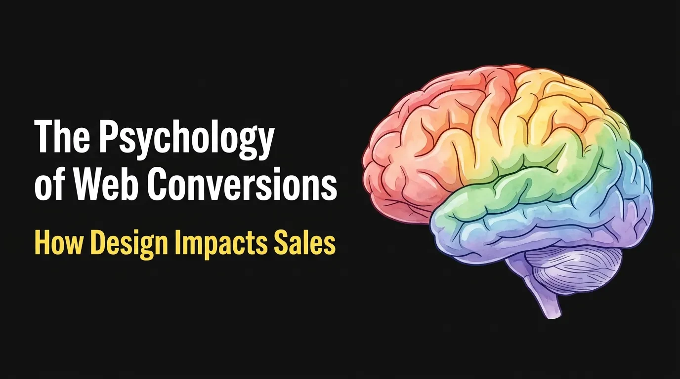
How Cognitive Biases Decide Whether Your Web Design Converts
Visitors don’t read your website — they judge it. Within seconds of landing, their brains have already answered three questions: can I trust this, is this for me, and what am I supposed to do here. Almost none of that judgment is conscious.
That’s why two websites with the same offer can convert at wildly different rates. The winning site isn’t prettier. It’s the one that works with the visitor’s mental shortcuts instead of against them.
The speed matters more than most owners realise. Psychologists call this fast, automatic thinking “System 1” — it runs on first impressions and shortcuts, and it has usually made the stay-or-leave call before any conscious reading begins. By the time a visitor is carefully comparing your features, dozens of smaller, invisible decisions have already filtered out most of the people who’ll never get that far.
Most advice on cognitive biases is written for UX designers, full of jargon and app examples. You don’t need 106 principles and a psychology degree. You need the handful of biases that show up on every business website, and the specific change each one demands.
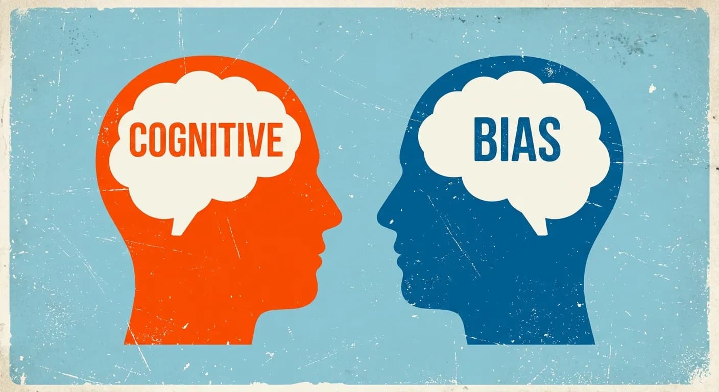
What a Cognitive Bias Actually Is — No Jargon
A cognitive bias is a shortcut your brain takes to decide faster. Processing every detail of every decision would be exhausting, so the brain leans on patterns: what did I see first, what are other people doing, what could I lose.
These shortcuts aren’t flaws, and your visitors aren’t being lazy. They’re being human, and they’re being predictably human — the same shortcuts fire for almost everyone, almost every time.
That predictability is the opportunity. If you know which shortcut fires at each point on your site, you can design for it deliberately instead of tripping it by accident.
The 7 Cognitive Biases That Shape Every Visit to Your Site
These are the seven we check on every site we design or audit at Vediwood. For each one: what it is, where it shows up, and what to change.
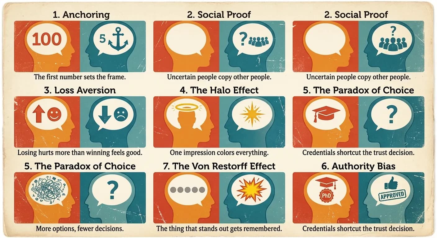
1. Anchoring — the first number sets the frame
People judge value relative to the first number they see, not in absolute terms. The effect was first documented by psychologists Amos Tversky and Daniel Kahneman in their 1974 research on judgment under uncertainty, and it has held up across five decades of replication.
On your website, the anchor is whatever price or figure a visitor meets first. If your pricing page opens with the cheapest plan, everything above it feels expensive. If it opens with your premium plan, your mid-tier plan suddenly looks reasonable.
The change: put your highest-value option first on the pricing page, and show the original price next to any discounted one. The crossed-out number isn’t decoration — it’s the anchor that makes the real price feel like a win.
2. Social proof — uncertain people copy other people
When visitors aren’t sure what to do, they look at what others did. A first-time visitor doesn’t know if you’re good. Evidence that other people chose you — and were happy — answers the question they’re silently asking.
The common mistake isn’t missing testimonials. It’s burying them on a separate page nobody visits, while the checkout or enquiry form — the exact moment doubt peaks — stands bare.
The change: move your proof next to the decision, not into a gallery. One specific testimonial beside the contact form, a review count beside the buy button, client logos under the headline. Specific beats generic: “cut our quote response time from 2 days to 3 hours” outsells “great to work with.”
One more detail that matters: numbers beat adjectives. “Trusted by 1,400 customers” gives the brain something concrete to copy, while “trusted by many” gives it nothing. If your numbers are small, use the specific kind of customer instead — “the checkout we build for independent food brands” is social proof for the right visitor.
3. Loss aversion — losing hurts more than winning feels good
Kahneman and Tversky’s prospect theory research (1979) found that losses weigh roughly twice as heavily as equivalent gains. A visitor is more motivated to avoid losing something than to gain the same thing.
Most business websites frame everything as a gain: “get more leads,” “grow your traffic.” That’s the weaker half of the equation. The stronger half is what the visitor is already losing by doing nothing — every month with a slow site is paid traffic that bounced, enquiries that went to a competitor.
The change: frame your core message around the cost of inaction, backed by something true. “Your slow checkout is losing you orders this week” lands harder than “a faster checkout will increase sales.” One caution: the loss has to be real, or you’ve crossed into manipulation — more on that below.
4. The halo effect — one impression colors everything
When one visible trait is strong, people assume the invisible traits match. A polished, fast, coherent website makes visitors assume the business behind it is competent. A dated site with broken spacing makes them doubt the product — even if the product is excellent.
This is the bias that punishes “we’ll tidy up the design later.” Visitors can’t see your service quality, your support, or your experience. They can only see your website, so the website becomes the proxy for all of it.
The change: fix the trust-killers before adding anything new — slow load times, stretched images, inconsistent fonts, copyright dates from three years ago. It’s why design and build quality are inseparable in how we run a web project: a beautiful site that loads slowly still fails the halo test.
5. The paradox of choice — more options, fewer decisions
In a famous 2000 field experiment, psychologists Sheena Iyengar and Mark Lepper found that a display of 24 jams attracted more attention than a display of 6 — but the smaller display produced ten times more purchases. Too many options doesn’t feel like freedom. It feels like work, and visitors respond to work by leaving.
On business websites this shows up as the everything-at-once homepage: nine menu items, four competing banners, three buttons of equal weight. Every extra option splits the visitor’s attention and shrinks the odds they take any action at all.
E-commerce sites pay the steepest price here. Product pages that offer six related products, a newsletter popup, and a discount banner before the add-to-cart button are asking the visitor to make seven decisions when they came to make one. Each decision is a small toll, and tolls add up to abandonment.
The change: one page, one primary action. Pick the single thing you most want a visitor to do on each page and make every other option visibly secondary. If your services page lists eleven offerings, group them into three — visitors can’t choose between things they can’t hold in their head.
6. Authority bias — credentials shortcut the trust decision
People give extra weight to signals of expertise. It’s why a doctor’s recommendation moves you more than a stranger’s, and why “as seen in” logo strips exist. Visitors use authority markers to skip the slow work of evaluating you from scratch.
Most small business websites under-claim here. The owner has fifteen years of experience, real certifications, and recognisable clients — and none of it appears anywhere near the point of decision.
The change: surface your real credentials where the decision happens. Years in business, certifications, named clients, press mentions, the founder’s actual face and name. Articles signed by a real person with a real role outperform anonymous “team” content — it’s the same reason this article carries an author, not a logo.
This bias also rewards being specific about what you don’t do. “We build e-commerce and media sites — we don’t do everything” reads as expertise, while “full-service digital solutions” reads as nobody in particular. Narrow claims are easier to believe.
7. The Von Restorff effect — the thing that stands out gets remembered
When everything on a page looks the same, nothing gets noticed. The Von Restorff effect — also called the isolation effect — says the one element that visually breaks the pattern is the one people remember and act on.
This is the psychology behind every effective call-to-action button, and it’s destroyed by enthusiasm: when the header button, three banners, and four links all shout in the same accent color, the visual hierarchy is gone. Distinct only works if it’s rare.
The change: reserve one color on your site exclusively for the primary action. If your buy button is orange, nothing else on the page is orange. Visitors should be able to squint at any page and still see exactly where the action is.
Where to Start: Three Changes Worth Making This Week
You don’t need a redesign to act on this. In our experience auditing business websites, three of these fixes deliver most of the value and need no developer at all.
- Cut each key page to one primary action (paradox of choice + Von Restorff). Demote every competing button and link to plain text.
- Move one specific testimonial next to your form or checkout (social proof). Beside the decision, not on a testimonials page.
- Reorder your pricing so the premium option anchors the page (anchoring). Then check what each plan is compared against.
Know what you’re measuring before you change anything. Note your current conversion rate, form submissions, or add-to-cart rate from your analytics, make the changes, and compare the same numbers four weeks later. Without the before-number, you’ll never know whether the change worked — and you’ll be back to deciding by taste.
Do those three, watch your numbers for a month, and you’ll have evidence — not opinion — about how much psychology was costing you. The deeper fixes, like halo-effect trust signals and loss-framed messaging, are where a proper design and build process earns its keep.
The Line Between Persuasion and Manipulation
Every bias on this list can be abused, and you’ve seen the results: fake countdown timers, “only 1 left!” on digital products, guilt-trip opt-outs like “No thanks, I hate saving money.” These are called dark patterns, and they work — once.
The cost shows up later. Visitors who feel tricked don’t come back, don’t refer, and increasingly call it out in reviews. Regulators have noticed too, and fake scarcity claims now carry real legal risk in many markets.
The test we use is simple: a bias used well removes friction from a decision the visitor already wants to make. A bias abused manufactures pressure toward a decision they don’t. Real reviews, real deadlines, real credentials — the psychology works just as hard when everything behind it is true.
Want a Website Designed Around How People Decide?
You now know more about cognitive biases in web design than most agencies will ever mention. The seven above are checkable on your own site this afternoon — start with the three quick fixes and measure.
If you’d rather have it done properly — psychology, design, and build handled as one decision instead of three — book a free call with Sadiki. You’ll get an honest read on what your site is doing to visitors’ decisions, whether or not we ever work together.
Follow Us
Most founders read us once and change something that week.
Every issue covers one thing that makes your website work harder — better conversion, stronger SEO, or smarter design. No fluff, no agency speak. Just the decision you need to make this week.
Our Team

Sadiki Said
Full Stack Developer

Nezha Essyed
Content Strategist